I noticed a huge change in my audience’s reception to the way I presented my analysis once I began incorporating more charts and graphs into my presentations. They understood the data better, they asked better questions, and they were able to make better-informed decisions. They went from wasting time trying to understand the data (entirely my own fault) to just needing a high level walk through of the analysis and then jumping right into strategic planning. The latter should always be your goal; make you data as self-explanatory as possible. Excel charts & graphs will definitely help!
If you’re not already using these powerful excel tools, I urge you to consider it for yourself and for your company. In this section I’ll show you how to create graphs, how to choose the right graph to illustrate your data better, and how to synchronize your PowerPoint presentations to excel so that when you make changes excel can automatically update your power point slides.
Let’s use the same sales data we’ve been using and illustrate our data with a line graph.
Highlight the data you want to be represented by your graph (yes, leave out the totals here because that will skew the graph):

Go to the Insert tab and you’ll see a menu full of options for creating graphs:
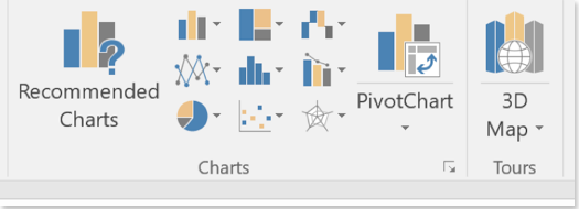
Choosing “Recommended Charts” is a great way to start out if you’re new to this or want some suggestions. I’ve used this option many times and ended up with a graph that represents my data much better than the one I originally intended to use. For our graph, we’ll use this option:
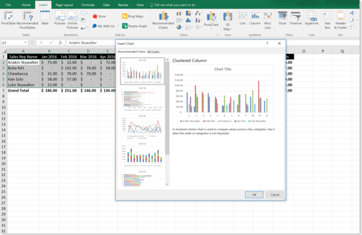
Excel already has a ton of great options for us to use. For now, we’ll go with the third option, the line graph:
Easy-peasy! Now we have a graph to represent our data, and we didn’t even break a sweat.
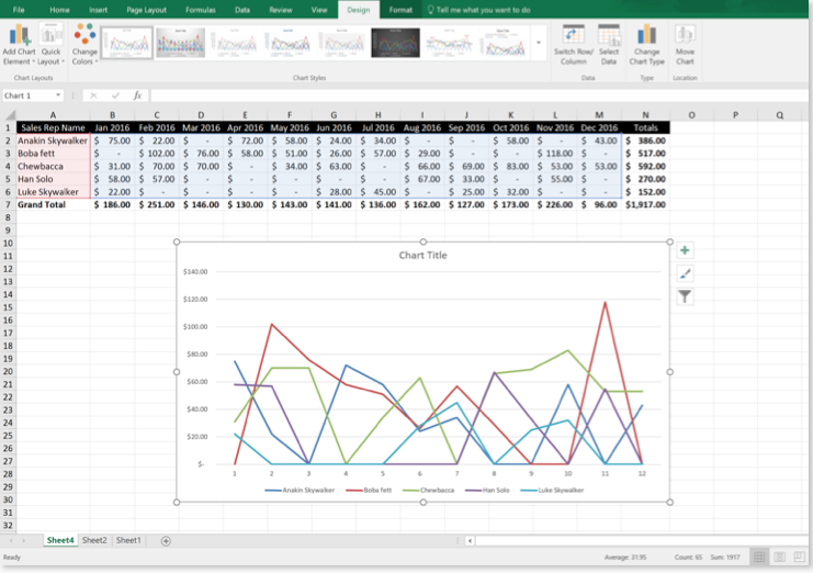
Something isn’t quite right though, there’s a lot going on in our line graph and its difficult to decipher meaningful information! Maybe we should only focus on one rep for this kind of graph; we’ll leave everyone out and only illustrate Han Solo’s performance since he likes to talk a big game!
Select the graph and go to the design tab under chart tools. In this area, click on Select Data and you should get the following window:

Go ahead and deselect everyone in the Legend Entries (left hand side) except for that arrogant Han Solo guy!
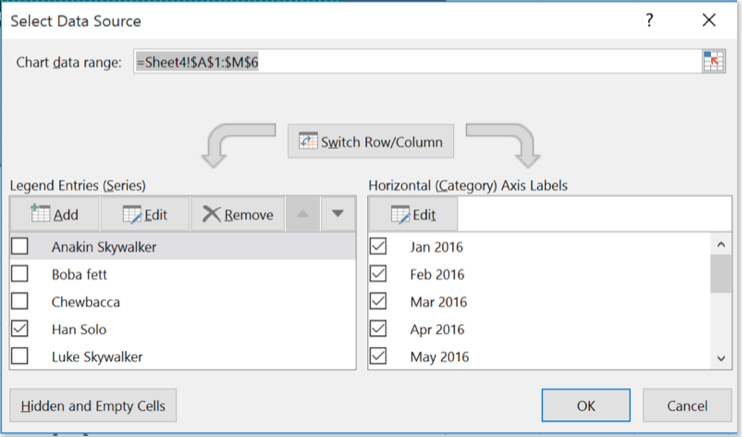
Once you hit ok, the graph will update and only show you Han Solo’s performance for the year.
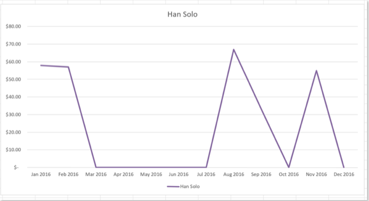
Hmm… between March and July he should have spent less time talking to Leia and more time focused on bringing in new business!
Now that we’ve satisfied our curiosity, the Sr. VP of sales still needs this data for all reps, and a line graph won’t cut it because you don’t have the time, or the patience, to answer his million questions about how to read the data. Remember, the key here is to make your data as self-explanatory as possible so that you can finally go to lunch on time!
Lets see the different ways excel can display our data in a graphical format:
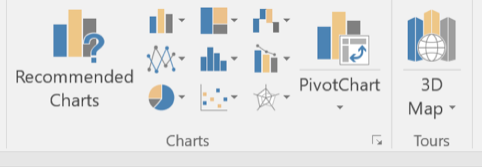
Highlight your data again, go to the insert tab and click on recommended charts
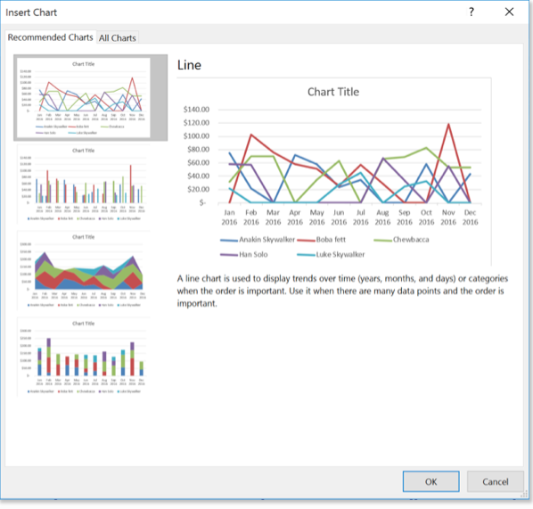
ach of the four recommendations has its advantages and disadvantages, but I think the best one to go with is the stacked bar graph. It displays all of our data in an easy to ready, easy to follow format.
Select the stacked bar chart and click ok.
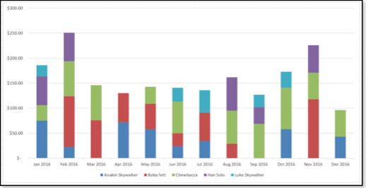
I can already tell, just at first glance, that Boba Fett and Chewbacca are the two best sales people (lots of red and green). Always aim, as best you can, to give instant impressions with your charts and graphs; your boss will love you for it and you’ll save a lot of time explaining things.
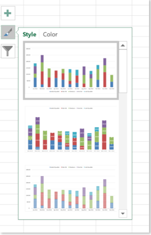
Excel makes it easy to customize the style and colors of your graph with a few clicks.
If you click on your graph you’ll immediately notice three boxes appear on the right side:

When you click on the paint brush tool, you’ll see different styling options to choose from:
Notice there’s another tab to choose from at the top; Color. Here, you’ll find different color options to use:
Maybe the person who will see these charts appreciates seasonal fall themes:


Syncing Excel with Power Point
During one of my many late nights trying to complete the financial reporting cycle I was in the middle of manually updating graphs on my monthly slide deck. I asked myself if there was a better, faster of way updating all my slides data; and there is! I banged my head against the wall a few times, but I finally figured it out and got my slides synchronizing with excel. I’ll show you how it’s done, and its easier than you might think!
Once you have PowerPoint open, all you have to do is cut and paste your chart over from excel.

Just select your graph and cut (NOT copy, it won’t work the same).
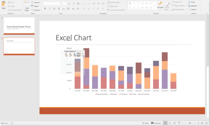
Then paste it in PowerPoint:

You’ll notice that when you paste over the graph the colors change. This is because PowerPoint automatically changes the formatting and colors of the graph to match the slide deck’s theme. If you want to keep the original colors, there is an extra step.
After the graph has been pasted to PowerPoint, a small icon should appear to you on the bottom right-hand corner. Click on it
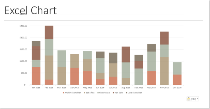
The fourth icon in the dropdown gives you the option to keep the source formatting and link the data. Click on this and you are good to go!
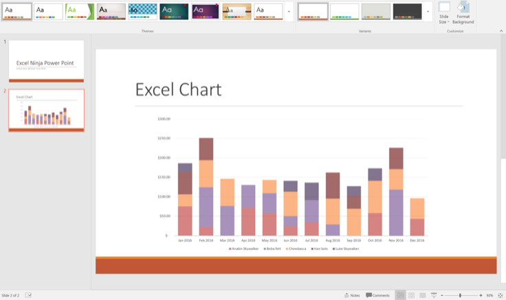
Now, let’s see if the data is really synchronizing with excel.
It turns out that Han Solo didn’t spend as much time flirting with Leia as we thought during March, April and May of last year and actually closed some sales. He sends you an email with his sales numbers for those months:

Let’s enter these sales on our data table:

Notice how our graph changed now that we updated the table:
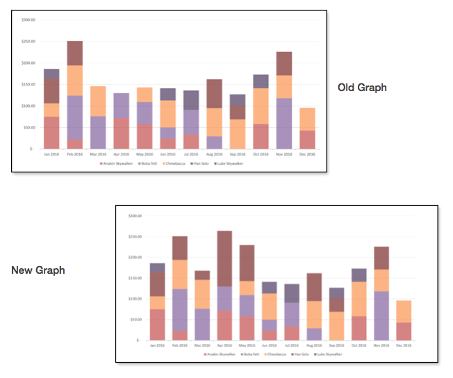
This added a tremendous amount of efficiency for me during my financial reporting cycles. Instead of redoing each graph every month; I created a workbook that had all the monthly data my CFO wanted to see. All I had to do is update my workbook each month, rollover the previous month’s PowerPoint file and update/refresh the charts.
