Imagine yourself becoming the go to person when it comes to business analysis at your company…
Becoming so intimately knowledgeable of your company’s operations that you can cite numbers off the top of your head to drive strategic decisions during high-impact meetings…
Becoming so valuable to your employer that they can’t afford to lose you to the competition, even if it means paying you thousands more per year!
This is what Excel power users accomplish at their respective companies all the time. They use their Excel skills, along with their company’s business reporting tools to answer upper management’s most critical questions.
In this article we’ll discuss some actionable tips that will immediately upgrade you, sending you on the shortest path to being an Excel power user.
Ready to begin?
Using Pivot Tables
First of all, pivot tables might be my most favorite thing apart from Game of Thrones, Star Wars, and watching sports bloopers
The reasons are obvious, pivot tables are one of the most powerful features in Excel for analyzing data. Here are some not so obvious reasons why pivot tables are awesome:
- Pivot tables are the fastest way to analyze data and create powerful reports. You can literally put together a detailed report using a pivot table in seconds. If you want to build a dynamic dashboard with formulas I can see you investing the time to do that via excel formulas. Otherwise, try building a pivot table to get the answers you need.
- Pivot tables don’t require formulas to work. In fact, in a few clicks of your mouse you can have your data structured in a way that is meaningful and valuable without ever entering a single formula. Of course, if you don’t enter any formulas it also means that…
- Pivot tables don’t make mistakes! This is probably one of the biggest benefits; the calculations behind the pivot table is all driven in the back-end so you can sleep easy at night knowing that the calculation side of your table is 100% sound (of course, if you have garbage data that’s another story).
Let’s say you work for a sports magazine that is running an article about the number of homeruns hit in the 2016 MLB season (as of July). The editor asked you to build her a report that shows the number of homeruns in 2016 by league (American vs. National League).
You build out your pivot table and are getting ready to submit when you realize that you want to see the data broken down by team as well. Updating your report is as simple as dragging and dropping columns into the table and breaking down your data the way you need it.

You can also add new data to your table and refresh your references to update the pivot table without much time or effort. Seriously, It probably takes longer for Michael Scott to make a fool of myself (and that doesn’t take long at all).
Back to our example, you look at the data and you notice that the New York Mets have more homeruns than any other team in the National League (by a healthy margin). Why?? Could your data be wrong?
No, its actually because the Mets just signed Darth Vader to play…
Anyway…
Pivot tables offer powerful audit tools that help you drill down by double clicking on a number in the pivot table. This opens a new and generates a table with all the records that makeup the number you clicked. Now you can see exactly what makes up the number behind all those Mets homeruns!

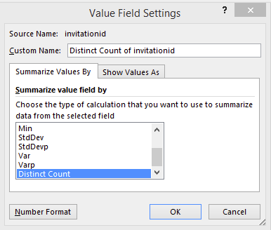
If you’re using Excel 2013 or above you can even leverage pivot tables to count unique records.
Try changing the summary functions:
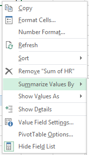
Right-click on any number in the pivot table:
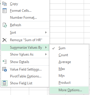
Go to the Summarize Values By section, click on more options, and then distinct count:
How do you create a Pivot Table? Learn more by clicking HERE:
Pivot Charts
Imagine the powerful engine of a pivot table driving your charts and graphs. That’s what pivot tables are!
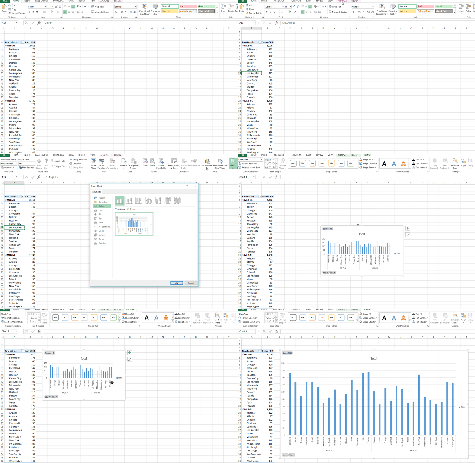
Just highlight your pivot table and go to Data>Analyze>Pivot Chart, and start dragging and dropping. In a few quick seconds you can visualize your pivot tables and really start knocking some socks off!
Slicers
Slicers are a powerful way of filtering your Excel tables, pivot tables, or even pivot charts. They’re like filters on steroids because they offer better features than regular Excel filters are you can enhance the look and feel of any report you prepare.
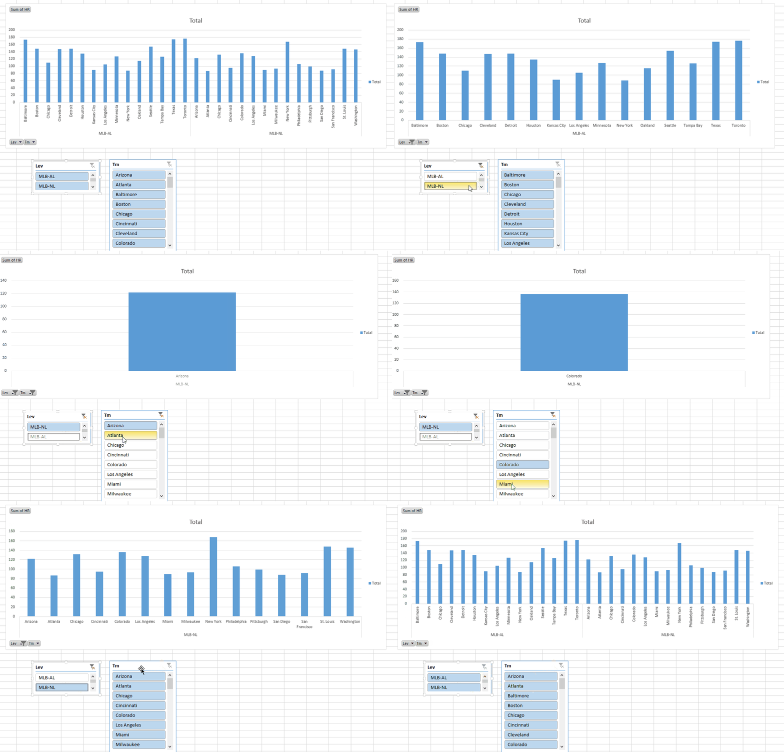
Use these bad boys and your boss will ask you to redo everyone else’s reports!
How to add slicers to your pivot tables
First step is to create a pivot table and add a slicer to it. Do this by clicking on your pivot table and, in the ribbon, under “Analyze” click on Insert Slicer.

Make charts interactive with slicers
Adding slicers to charts works similarly. Here are the steps:
- Create a pivot table and add slicers to it
- Create a pivot chart from your pivot table data
- Move the slicers next to chart
One of the best features of slicers is that you could connect multiple tables to one slicer. To do this, right-click on the slicer and select “Report Connections” (or “Pivot Table Connections” depending on your excel version)
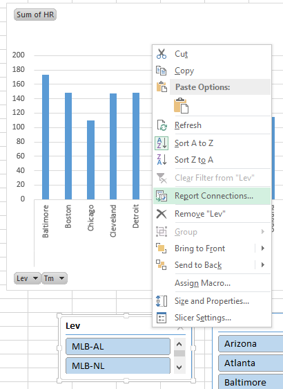
Excel will give you a list of all the pivot tables available. Select the ones you want to connect to and hit OK.
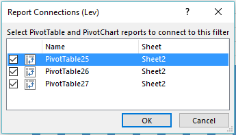
Note: if you don’t name your tables you’ll lose track of them because Excel defaults to a numbered naming convention. Name your tables!
Slicer functionality is just one piece to it, you also have to make your report presentable. Excel offers plenty of formatting options for slicers.
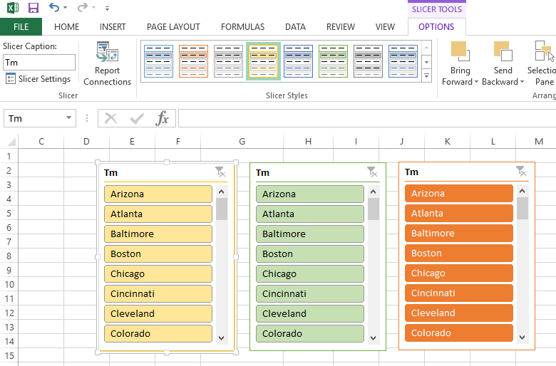
You can now use these slicers to build insightful visuals and powerful dashboards.
Text-to-Columns
Text-to-Columns is an Excel feature that lets you separate contents of a cell into separate columns. For me, it’s been most useful when I am trying to import CSV text files into Excel and all my data gets loaded into a single column.

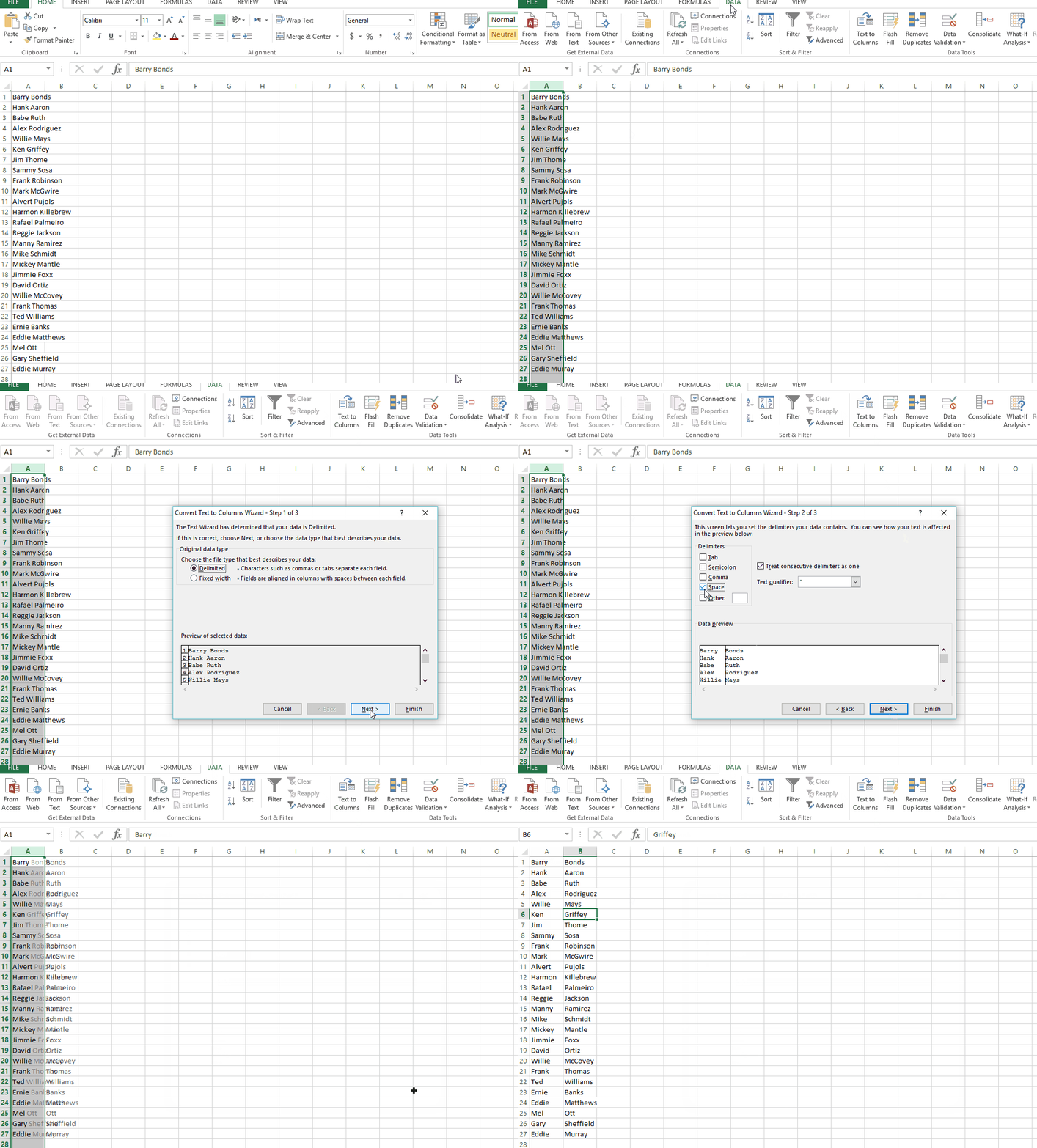
Go to Data > and click on Text to Columns

Choose Delimited and Click next

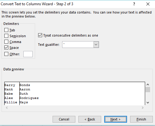
It’s time to choose your delimiters. Delimiters are what Excel will use to know whether or not to move data to a new column. For example:
The name “Barry Bonds” is separated with a space. If you want the first and last name in separate columns you would select space as your delimiter and click Finish.
OFFSET Function
Offset is an excel function that allows you to dynamically reference a cell (or set of cells) based on a single starting point.
With OFFSET you can build dynamic ranges into your formulas. First, lets look at how to write this function:
Warning: this may not make sense. If it doesn’t, hang in there it will all come together soon…
=Offset(reference,rows,cols,[height],[width])
Reference – Your function’s starting point
Rows – How many rows to navigate away from the starting point. Enter a positive number to move down, enter a negative number to move up.
Columns – How many columns to navigate away from the starting point. Enter a positive number to move right, enter a negative number to move left.
Height – Optional: This tells excel how many rows to reference. Enter a value if you need to reference more than a single cell
Width – Optional: This tells excel how many columns to reference. Enter a value if you need to reference more than a single cell
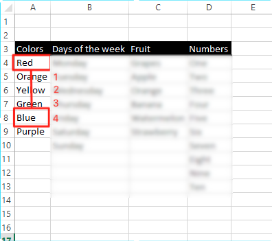
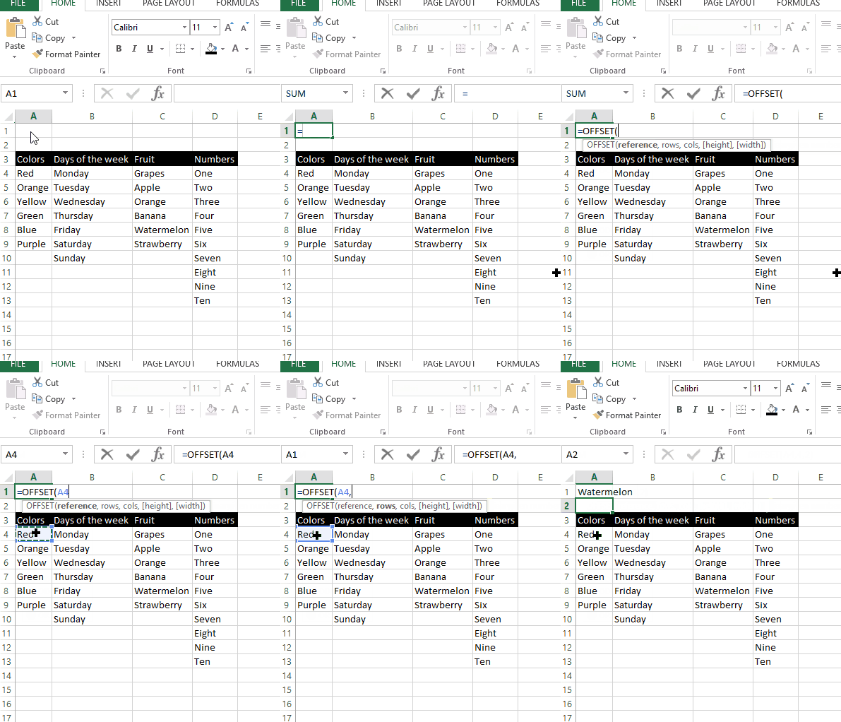
Lets look at an example. I have a table of labels that have nothing to do with each other. Lets try to use offset to reference the cell labeled Watermelon.

=OFFSET(A4,4,2)
Our starting point is A4 and we’re moving down 4 rows.
=OFFSET(A4,4,2)
We’re half way there. Now we just need to move 2 columns to the right
=OFFSET(A4,4,2)
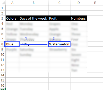
And we have our result.
This is really useful when you want to build super dynamic sheets that reference different sized ranges or cells depending on a few inputs. Recently I came across a scenario where I had to find the average dollar figure before and after a sales event.
I had to make my formula dynamic enough to factor in different dates and find the average before and after that date.
SUMPRODUCT Function
At first glance SUMPRODUCT seems pointless, but it’s actually one of the most powerful Excel functions and can be used in many versatile ways.
SUMPRODUCT multiplies the arrays you choose, then adds them together. Lets look at an example of how SUMPRODUCT works:
Here we have two columns of numbers.
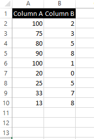
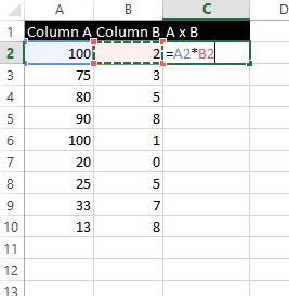
Without SUMPRODUCT, you’d have to multiple both columns, then SUM the result together:
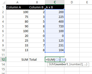

You can skip all that fuss with just one step!
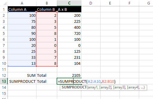
Here is how it works in real-time:
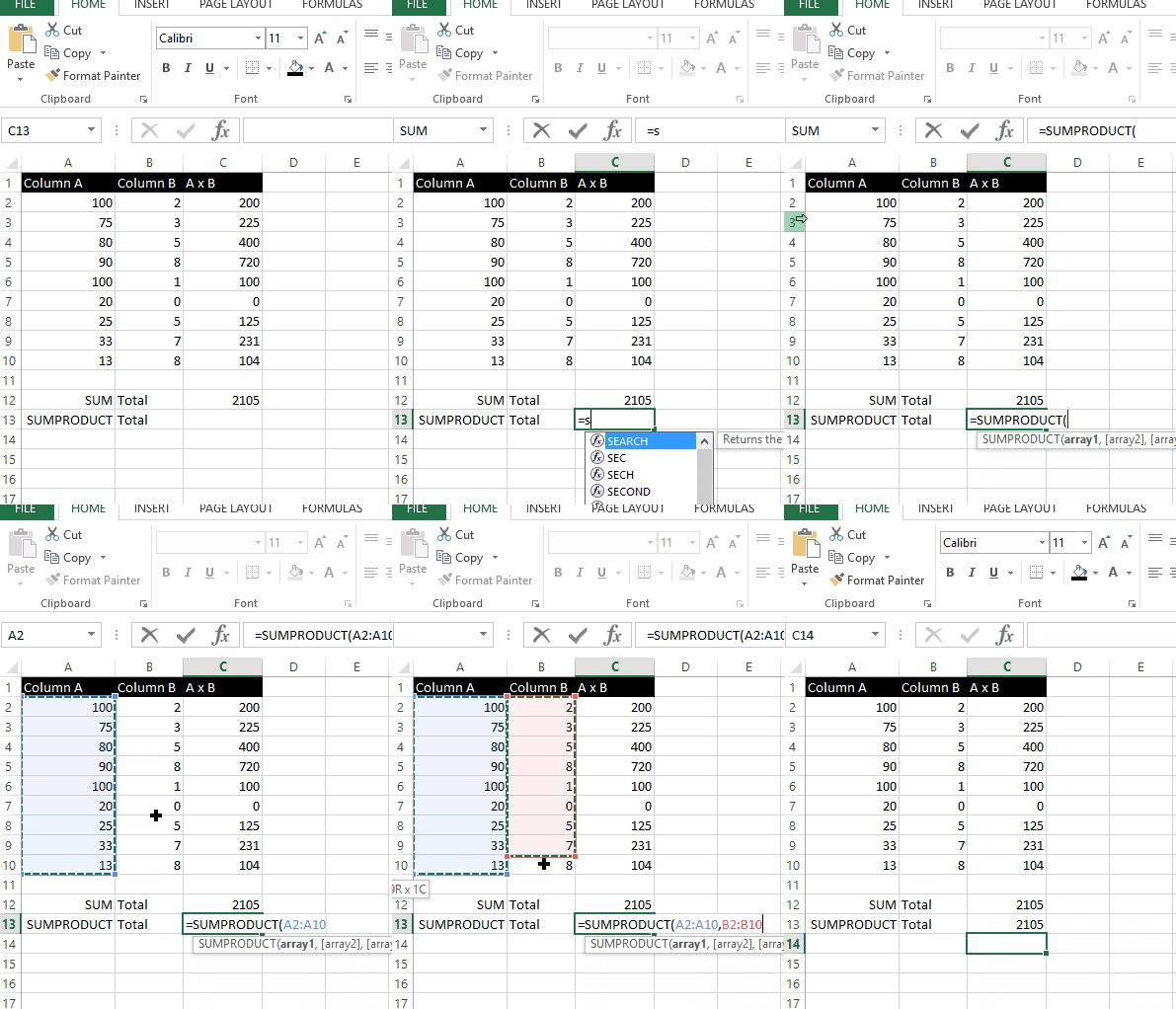
Now that you know how this function works, keep reading to find out how to use SUMPRODUCT in a practical scenario…
SUMIFS with OR Criteria
Ok, after reading that last section you’re probably thinking “ok, BFD!”
Wait for it, we’re getting there…
Let’s say you’re working on a report and want to use SUMIFS to total up sales for two sales reps. There are different roads you can take to get to the same result, but most people would simply create two SUMIFS and add them together in a single cell. There’s a much more efficient way to accomplish this.
Just wrap your SUMIFS in a SUMPRODUCT
The SUMPRODUCT acts to merge both SUMIFS into one super SUMIFS.
In our example we have a table with sales activity for several sales reps. I want to know what were the total sales for Jim Halpert below $500, and total sales for Dwight Schrute above $750. If we consider the traditional way of calculating this it would look like the following:


Here is how it works using SUMPRODUCT:


Just like a regular SUMIFS, you highlight your criteria range then highlight your criteria. Nothing to it…
![]()
Linking Workbooks and using the Edit Links Menu
Linking separate workbooks doesn’t have to be so complicated, you just need to know the quirks of how Excel handles data links.
Link workbooks like this:
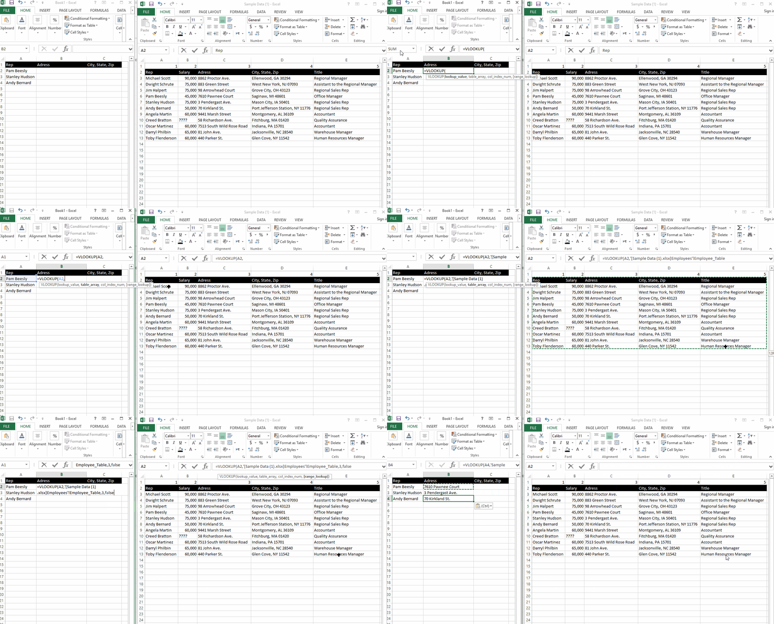
It’s easy to start losing track of which workbooks you are linked to, especially when you start building more complicated reporting systems.
You can see which files your Excel is linked to, go to Data > Edit Links. Excel provides a list of all links that affect your sheet.

From this menu, you can open up any relevant workbook and refresh your data.

Index Chart
Ever heard the saying “you can’t compare apples and oranges?” Not true…
Index Charts are useful when you want to compare growth trends between two vastly different numbers. One of the most common places this is used is in stock market analysis.
For example, I’m considering investing in either Google or Apple and I want to compare performance of these stocks over the last two years to base my decision. As of this writing GOOG is hovering around $750/share, and AAPL is around $100/share. How do you compare the two stock’s performance against each other?
Start by anchoring the two beginning values to a common starting point, then figure out the percent change of each stock over time. It would work like this:

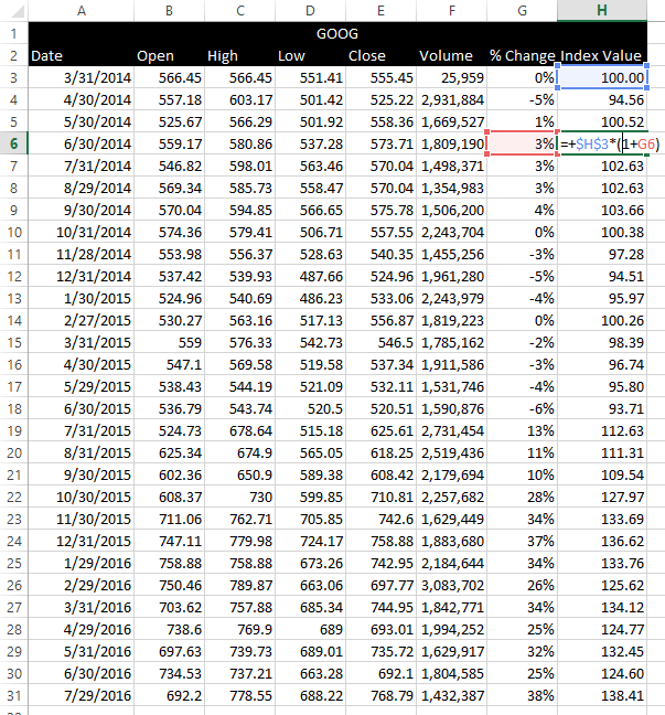
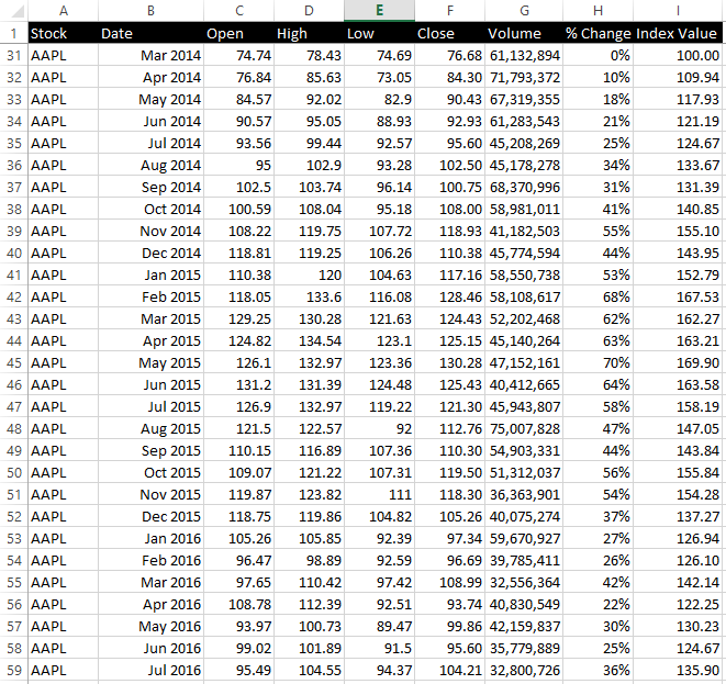
Once you’ve gone through this exercise for all your data, It’s time to map the results:

Interestingly enough, AAPL performed better until about Q4 of 2015 when both companies were pretty matched up.
Weighted Average
Weighted average is a more accurate way of representing averages because they take the weight of each number’s occurrence or significance in the dataset into account.
Lets say that you run an online business that sells three products; a high-end product, a mid-range product, and a low end product.
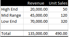
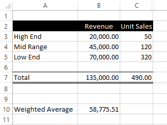
How would you represent the average revenue per brand? If you said $45,000, you’re wrong. You’re not taking into account how many unit sales factored into generating that revenue.
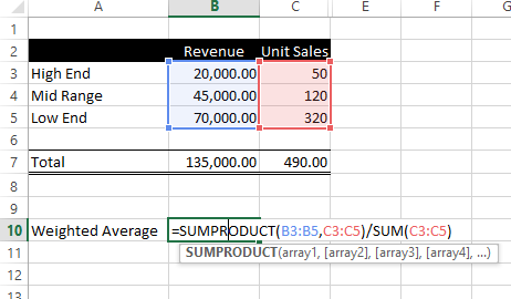
How do we calculate the weighted average? You can use SUMPRODUCT to figure it out like this:
Filter Top/Bottom data points
Whenever you have too much data to look through, you can filter your list with the top or bottom values only and leave the rest. For example, here is a list of Apple’s daily stock prices over the last five years:
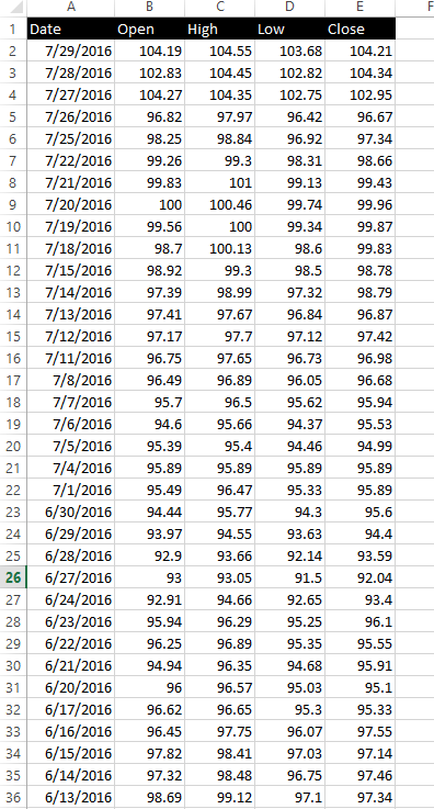
YIKES!
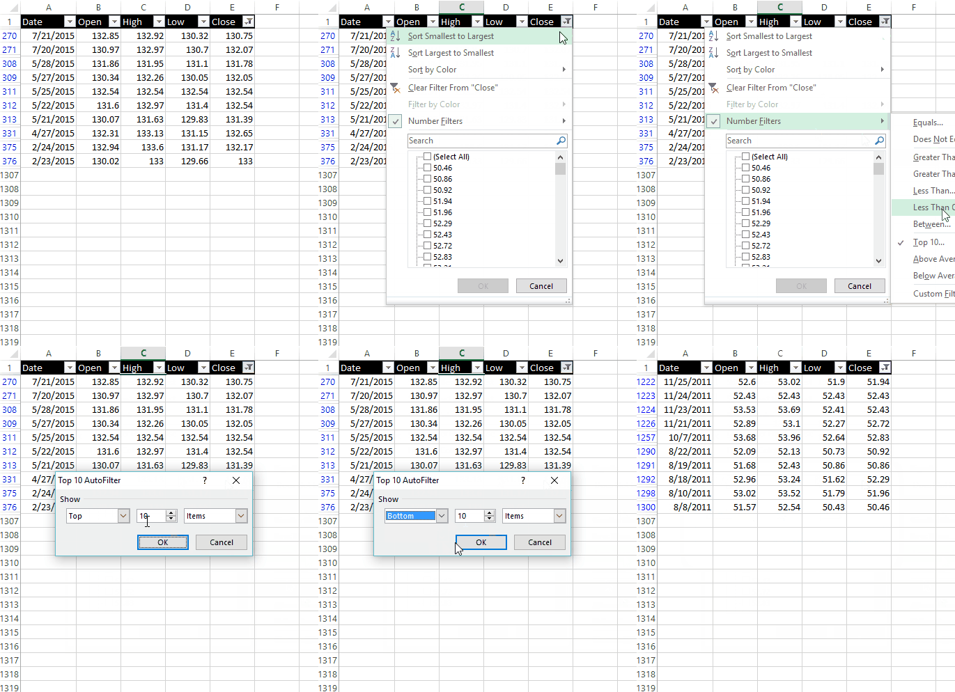
I’m curious to see which were the top 10 closes over this time period.

Now we have a top 10 list and can try and figure out what was happening during this time to cause the stock’s price. Was it that the company released positive quarterly numbers? Maybe the announcement of the first apple watch?
Similarly, we can get a bottom 10 list:
Break Dates into separate columns
When summarizing numbers by date I tend to make things easier on myself by breaking out years, months, and sometimes days into separate columns.
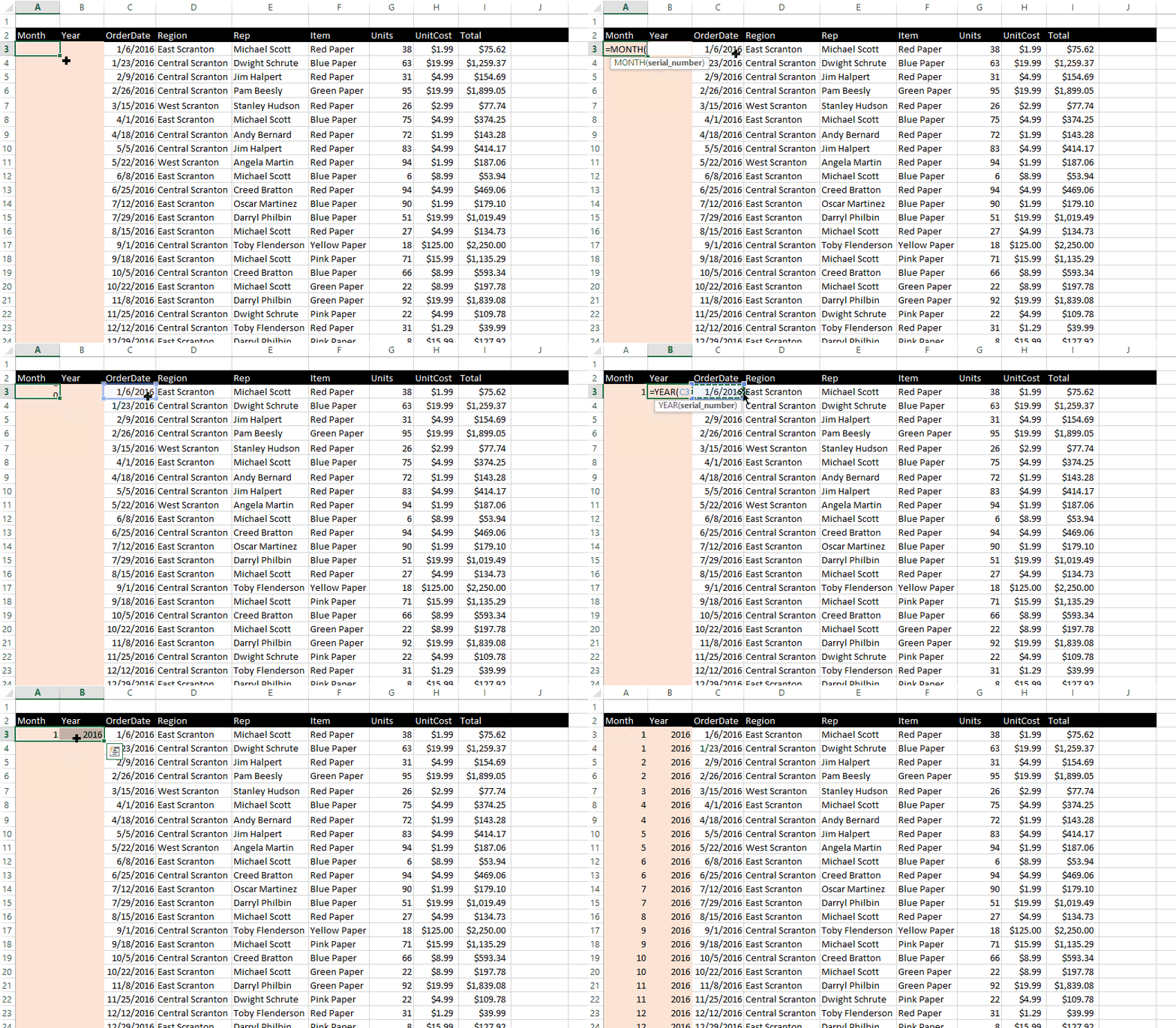
This prevents making formulas more complicated than they should be by allowing me to reference these columns.
Compare data YoY, MoM and use conditional formatting
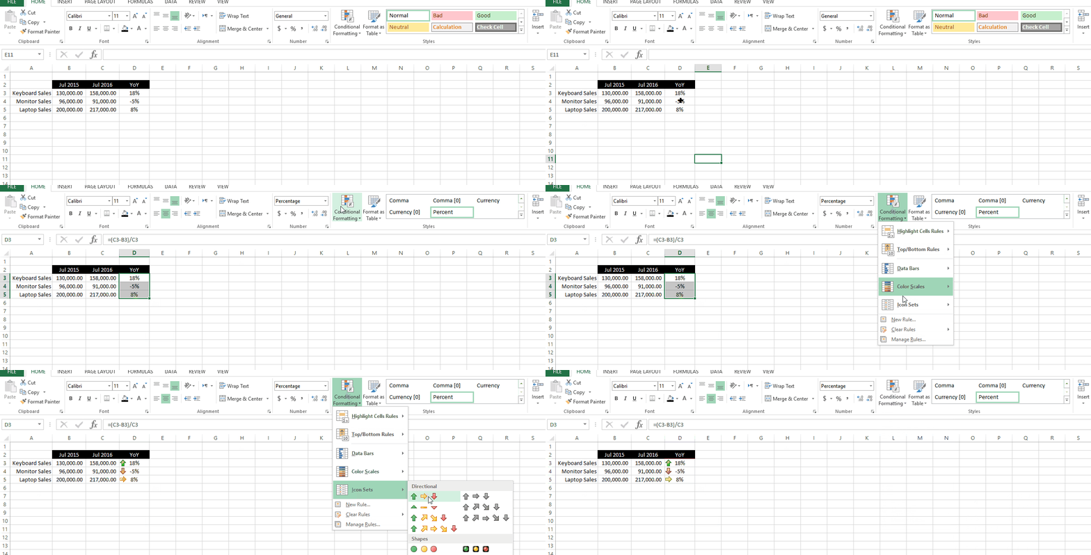
If your business is seasonal, it would be foolish to compare sales from one month to the next. Not only should you compare data MoM or YoY to produce a more effective analysis, you can use conditional formatting to illustrate those changes.
Sparklines
Sparklines are a cool visualization trick that can turn your reports and dashboards up a notch. You can use sparklines to visualize your data without cluttering your sheet with too many charts and graphs.
This is how it’s done:

Quick Analysis
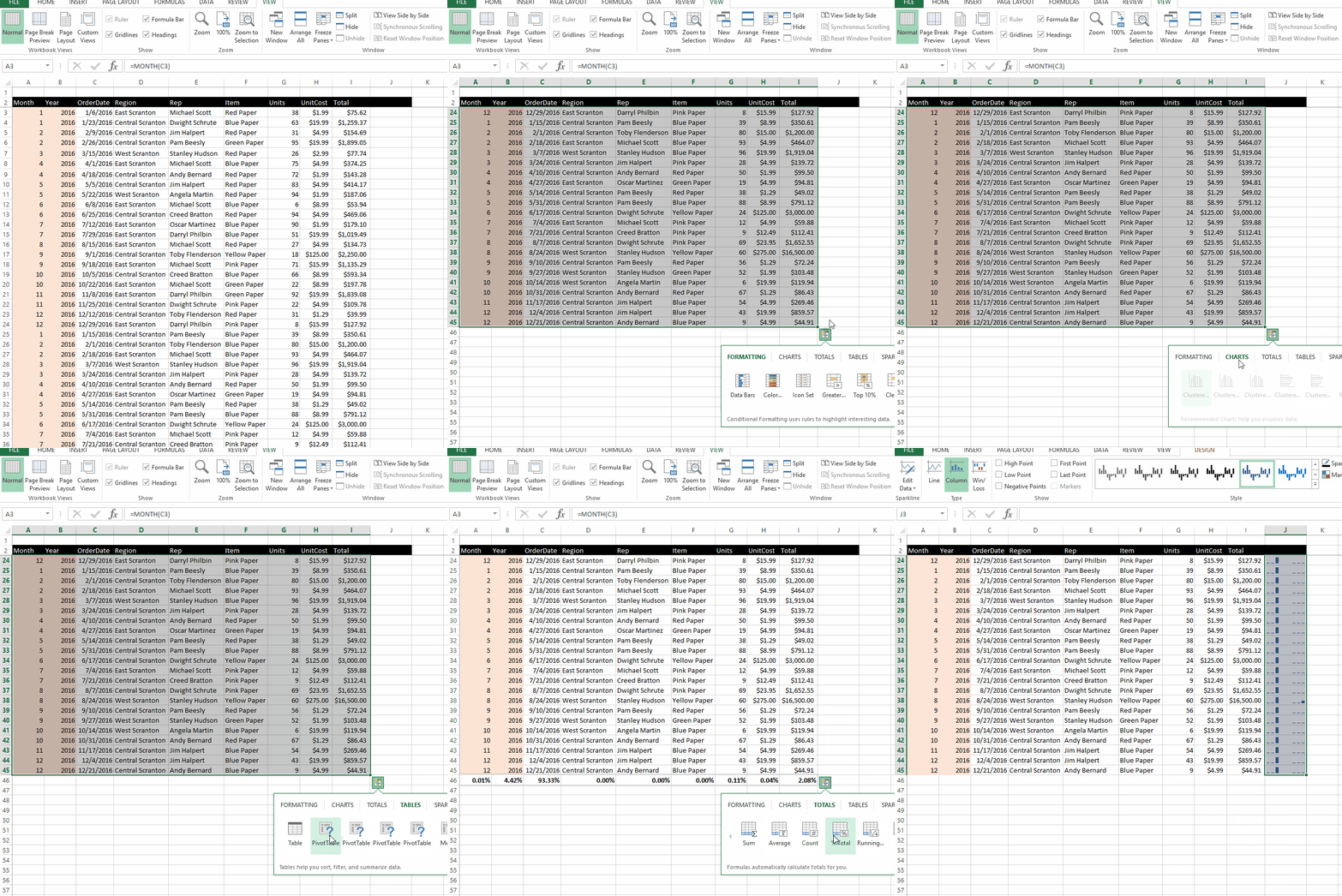
If you have Excel 2013 or above you can take advantage of the Quick Analysis feature. Just highlight any data or table and click on the small ![]() at the bottom of your selection. Excel will open a window containing a plethora of charting and analysis options.
at the bottom of your selection. Excel will open a window containing a plethora of charting and analysis options.
Quick analysis reviews your data and recommend different pivot table options, charts, and can even insert sparklines for you. Check it out:

Thanks for your article! I am just getting used to using excel and analytics, but had yet to learn about pivot tables. I’m really excited that I don’t need formulas to use them. However, I don’t think they will ever fall in a list of my favorite things after Star Wars. I’ll wait until I try them before making my ultimate judgment here, though.