How to create Dashboard that your boss will absolutely salivate over like a chihuahua on a hot summer day!
Imagine being asked to provide senior management at your company with a comprehensive overview of the company’s sales during the quarter. The data you provide will help them drive critical decisions that will carry the company into the future.
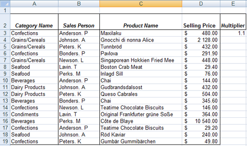
Do you submit this?
Or this?
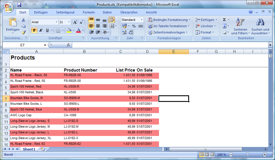
How about this?
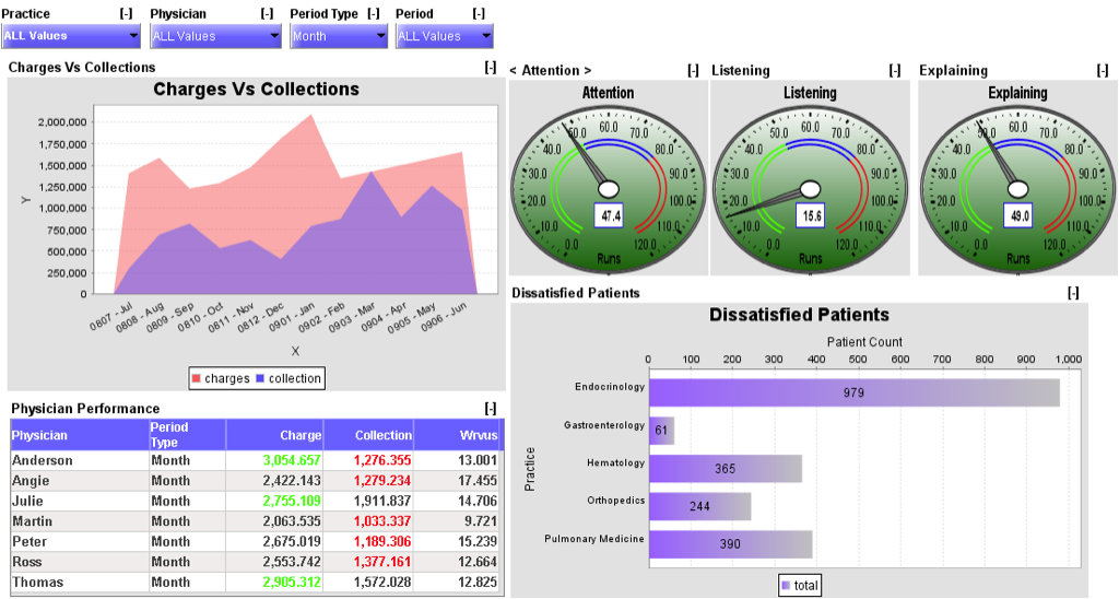
Maybe you like getting this reaction out of your boss…
I hope you answered “HECK NO!” to those questions.
There is something in common with all three images, none of them convey any kind of unified message. Are we doing good? Are we doing bad? I don’t know!
Although I’m going to focus on the tactics to creating a clean, easy to read dashboard that your boss will absolutely salivate over like a chihuahua on a hot summer day, overall strategy remains the same throughout this article.
In order to create dashboards you must keep the following things in mind.
- Know your audience
- Understand the story you want to tell and it’s implications
- Identify the most important metrics that support the story
Knowing your audience
I have a question for you:
What’s worse, getting your mother-in-law nothing for her birthday…
…or…
buying her a massive bouquet of gorgeous flowers only to later find that she is horribly allergic to them (and you forgot about that minor detail)?
Know your audience! Your professional success, your personal relationships, your daily interactions, your life all depend on this. You know it, I know it, Hailey my Siberian Husky knows it…

*all she wants is for you to become an Excel ninja… that and a doggie treat…
If everyone understands that knowing the audience is critical, why do so many people still create crap-tastic looking reports that nobody can use (except the person that made it)?
Creating useful dashboards that make your boss keep coming back for more like their addicted is no different.
When you create your dashboard, are the people who will be using it number savvy or do they require a bit of hand-holding?
Are they familiar with the business activities your dashboard represents?
Think about whether your dashboard will be self explanatory to your audience, or if you’ll need to add some notes or additional context for your audience to understand it.
Understand the story you want to tell and it’s implications
At my office there are specific people I avoid running into. Not because I dislike them, but because the second I make eye contact they start going on and on about some unnecessary weekend story that I don’t care to know about.
Just like don’t like wasting my time, neither do the people who will be using your dashboard. There is always a reason behind every request, so spend some time figuring out why they asked for the dashboard to be created, figure out how decisions will be made based on the data presented and tailor your dashboard to that.
For example, maybe they want to see where sales are trending over a period of time so they can decide whether or not the compensation plan needs to be revised? Line graphs that show the team’s sales performance overlaid with compensation data over the same period could be very useful.
Identify the most important metrics that support the story
I love watching movies, especially Star Wars. One thing that can turn a great movie into a terrible one (like the Arrival) is when it focuses on the wrong things and, as a result, contains filler content or leaves too many unanswered questions.
I’ll use Arrival as an example. In case you haven’t seen it, this movie is about an Alien species that lands on earth and the government’s response to this threat through diplomacy.
The movie is almost an hour through before we (the audience) get to see anything interesting (like aliens!) and somehow the language expert goes from Rosetta Stone level zero in “Alien speak” to discussing the meaning of life.
The movie spent too much time getting to the climax without being entertaining along the way.
Your dashboards aren’t supposed to entertain anyone (or maybe they are, who am I to judge), but they are supposed to show the most important metrics at a quick glance so that your audience can move on with their decision making. Which metrics support your story the most?
Average sale per sales rep? LTV of a customer today vs. a year ago? MoM, YoY churn rate?
Whatever it is, be clear on what metrics will be the most useful to your audience and make sure to include them front and center!
Ok, ok… I get it. Show me how to make dashboards that my boss will drool over already
Time to rock and roll…

For me, the one common trait that differentiates good dashboards from craptastic ones is none other than our good old friend simplicity.
Let’s agree on one thing here…
More… Is… Not… Better!
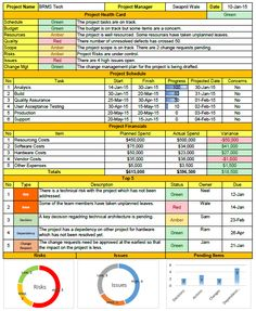
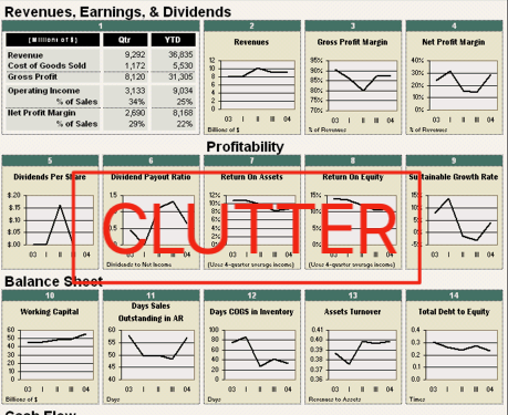
So stop stuffing so much data and charts into your dashboard. It doesn’t look cool and confuses the daylights out of people.
*What the heck is this??
Always try to aim for simplicity. Making things simple and easy to read adds value to your peers by making it easy on them to draw conclusions and move on to making important decisions.
In order for me to achieve this I have two rules that make up my overall strategy to creating effective dashboards:
- Make all the data you are trying to present fit on one screen
- Make sure anyone can find the data they’re looking for in a maximum of 30 seconds
Balancing these rules isn’t an easy thing to do, but making sure your audience has the absolute most important information and nothing more is a critical piece to making effective dashboards.

What do I do?
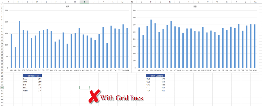
First thing is first, make sure you remove gridlines. When it comes to creating nice looking dashboards, having grid lines can be distracting and make your dashboard look more cluttered (remember, we don’t want this).
Take a look for yourself:

Where do I put my data?
Put your most important metric(s) at the top left hand side of your dashboard and preferably make this piece of data a graphical representation of your data (aka, a chart).
Does it matter where you put your important metrics? Yes, a lot more than people realize!
An article published by Kissmetrics, a marketing analytics firm, discusses findings made by recent eye-tracking studies. According to the article, people’s eyes navigate the computer screen in an F-Pattern:
“According to this study from the Nielsen Group, all across articles, e-commerce sites, and search engine results, people almost always browse in an F-shaped pattern that heavily favors the left side of the screen.”
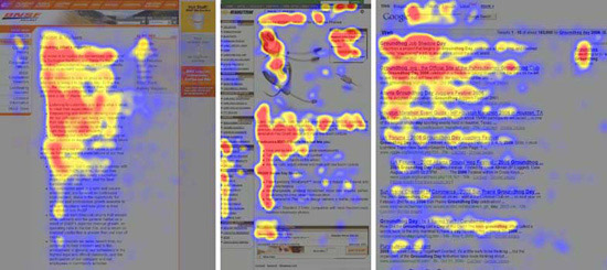
This research data directly applies to your ability to build effective dashboards for decision making. Since our thesis is to create dashboards that are simple and easy (aka quick) to use, and knowing that people tend to heavily favor the left side of the screen (in countries that read left-to-right), why wouldn’t you strategically place the most important data there?
Reading the article at KissMetrics made me realize something else (even though the article doesn’t exactly say it), we favor graphics and images over text. See for yourself:


Why read a bunch of text when you can get the message from looking at an image of a cute baby?
You can apply this knowledge to your dashboard. Would you rather put this in the top-left corner of your dashboard…

Or this?
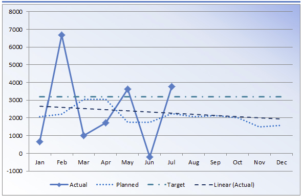
Both are great looking, well organized representations of data but if your aim is rapid data retrieval for your audience (remember, your stakeholders don’t have time to fiddle around with your dashboard) then the chart is best to use (and the table underneath).
Make your dashboard dynamic
The best dashboards allow users to interact with the data and change it to fit their needs. If end-user can make changes to the dashboard on the fly, they don’t need to bother you at 5:15 PM on a Friday to get data and you can get to happy hour before this happens:
One way to do this is to use pivot charts
Pivot Charts
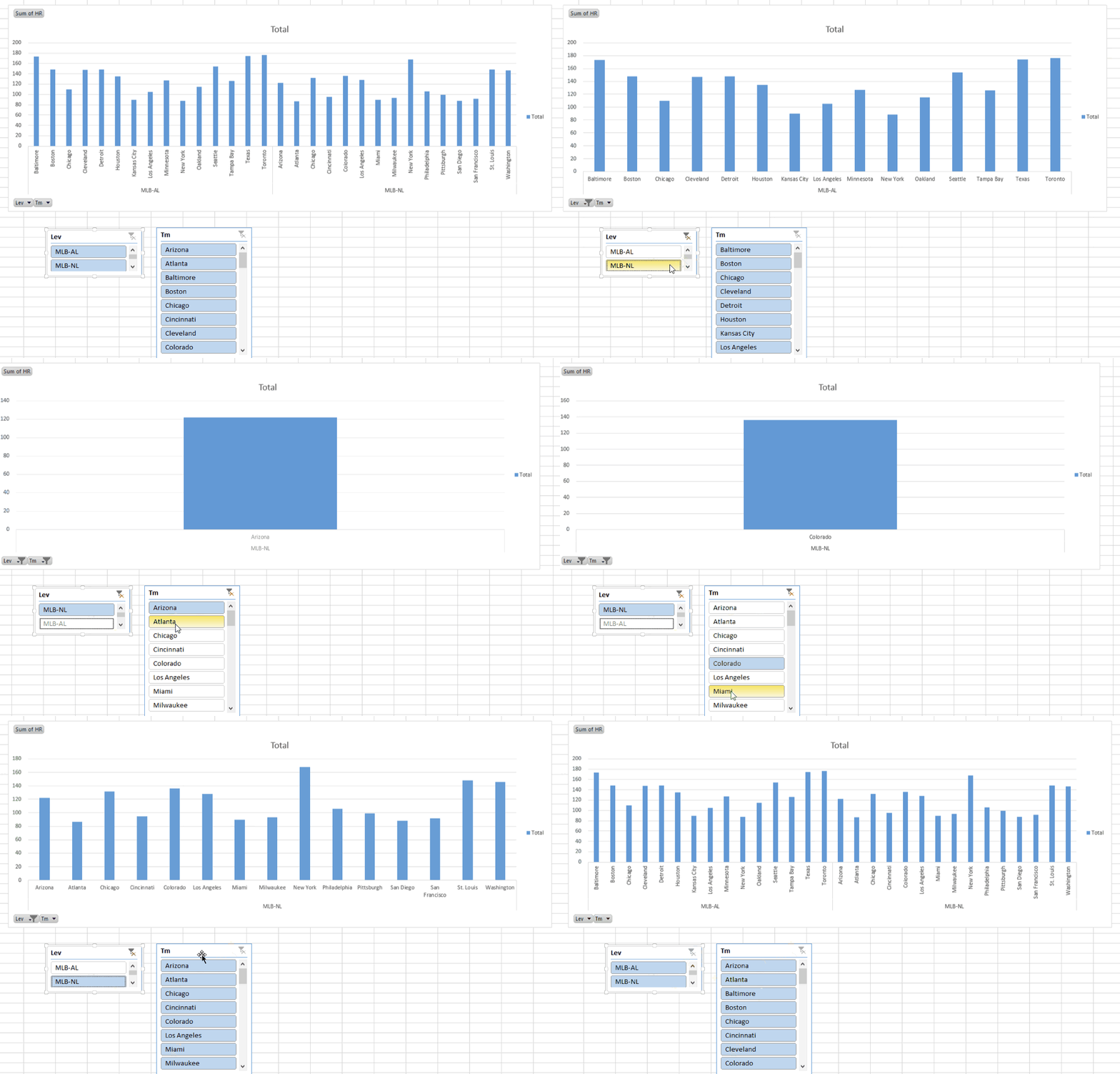
The beauty of using a pivot chart is that the data can be sliced and diced, just like a pivot table, except as a graphical representation of the same data.
Just highlight your pivot table and go to Data>Analyze>Pivot Chart, and start dragging and dropping. In a few quick seconds you can visualize your pivot tables and really start knocking some socks off!

If your user can update a pivot table, they can update a pivot chart in the same way!
Slicers
I love slicers! Besides drones, slicers are the best thing to hit the streets!
Powerful filters to help represent data on your dashboard in any way your user feels, except very easy to use (even for anyone who isn’t familiar with Excel) and they enhance the look and feel of your dashboard.
Besides giving your user the ability to filter data in different ways, it avoids you of having to build different dashboards for each way of looking at your data.
Make your dashboard easy on you
You can have the world’s nicest looking, dynamic, powerful dashboard but if it takes you a week to update it then what’s the point?
Make sure you make your dashboard easy for you to update (after all, you’ll probably have to update it periodically). Building an effective dashboard is as much about you as it is about your audience. You don’t want to be in the office at 9PM updating it like…

One of the ways to do this is to save your chart format template. For me, having a consistent chart format is a pain because it’s tedious. Not anymore:
Just right-click on any chart and click “Save chart template”
When you want to apply the template to your chart, click on the chart and select:
Design>Change Chart Type>Template> and choose the template you want to use.
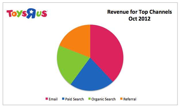
BONUS TIP: Use your company’s branding 😉
Another good way to make it easier on yourself to update your dashboard is to organize your sheets and data from the beginning.
Create a tab for your raw data (formatted as a table), one for the pivot tables that will drive the the pivot charts used on the dashboard, and another sheet for references (in case you need to create a table to reference data (ie. customer addresses, names, etc.).
The easier you make it on yourself to finish your dashboard, the quicker you’ll be out of the office and having dinner with family.
Here’s the point:
Building a dashboard that your boss and coworkers will drool over (and envy your mad skills at the same time) doesn’t have to be a chore, as long as you are strategic about it.
And for those of you looking for more advanced data visualization strategies,make sure to check out this book I read recently called Storytelling With Data. This is a phenominal book that improved my data visualization skills. These skills eventually helped me get approved to hire additional staff at work.
By the way, the link above is an affiliate link, which means that I earn a commission if you do end up purchasing this book. The commission is at no extra cost to you, and please if you have any questions related to this product, please let me know and I’d be happy to answer them for you.
