The pivot table is one of the most powerful data analysis tools in excel, and one of the most asked about as well. Pivot tables can take a large amount of data and organize it in a way that is easy to digest and analyze. It also offers tools to let you change the pivot table on the fly so you can continue to look at data in different ways.
You can take sales data and easily create a report of sales broken down by any other element in the original list (ie. by region, sales rep, month, etc.). Lets get right into it!
How to create a pivot table
Step 1: You need a list of data first.
Before we begin, you’ll need a list of data organized by column headers. The sorting of the data or the order of columns doesn’t matter, and if you have duplicate column headers you’re still good to go. The only thing you need to make sure of is that each column has a title. If you’re missing even one column title, excel will give you an error and you won’t be able to create your pivot table.
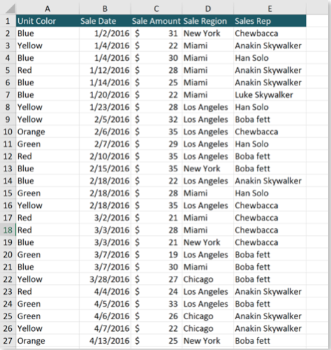
For our example, we’ll use this sample sales data.
Step 2: Go to the Insert tab and select ‘Pivot Table’

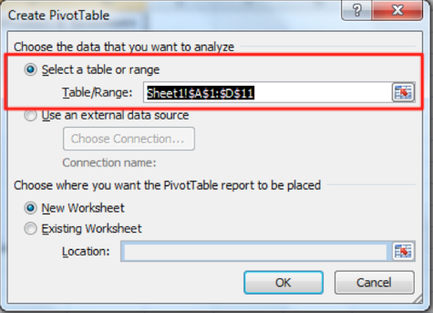
Step 3: Make sure your data range is selected
Step 4: Start adding data to your table
You’ll notice that there is a menu on the right hand side. This menu is where you will build your pivot table by dragging column headers into the different sections of your table.

Lets Get Practical
Let’s create a sales report broken down by year and by region!
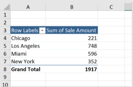
All we have to do is take the data labeled ‘Sales Region’ and drag it in the ‘Rows’ section, and the Sale Amount into the ‘Values’ section, like this:

Here is what the result looks like:
If you want to break this report down further and include the sales rep, all you have to do is add the sales rep data to the ‘Columns’ Section.
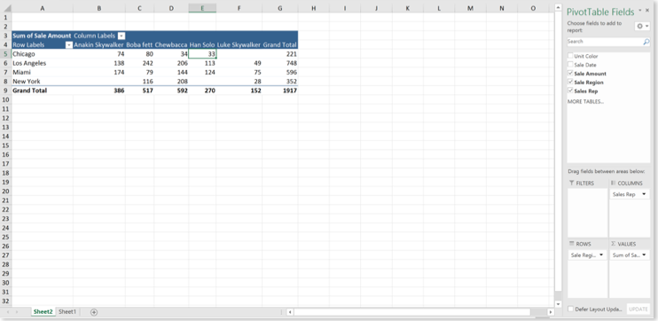
You’ll notice that the pivot table automatically adds column and row labels, and totals them for you. This makes things really convenient on you to analyze the data on the fly. If you don’t like how the data is arranged, you can flip the columns and rows in the pivot table menu.
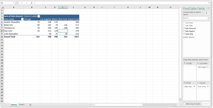
Lets create another report: Sales by Sales Rep, Broken Down by Month
Again, lets select the sales reps and drag them over to the rows section and the sales date into the column section
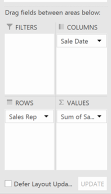

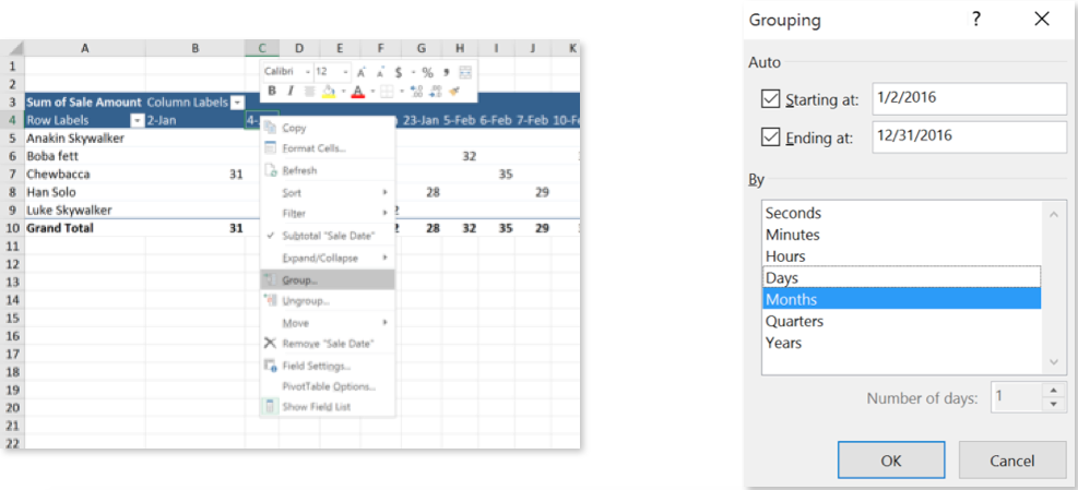
Something is wrong; the pivot table is giving us all this data broken down by day, but we need it grouped by month. No worries just right click and select Grouping. From the Grouping menu, select to group by Month.
If you need to format your data a specific way, just right click on the data inside the Values section and select Value settings:

With pivot tables, you can also drill down into any number and see the details behind it. All you have to do is double click a number and excel will automatically create a tab with a table listing out all the details of that number. Happy auditing!


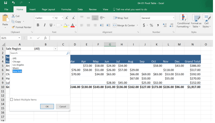
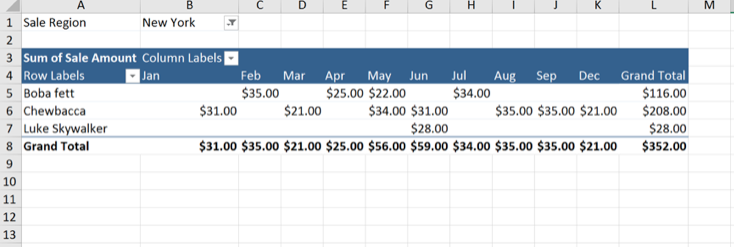
Let’s say, for example, you need sales by sales rep but only for one region, New York. Just add Sales Region as a report filter by dragging it into the filters section and you will be able to hide all the other regions in your data, only displaying data for New York.
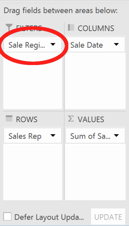
There is no end to the possibilities with Pivot Tables. You can slice and dice your data a ton of different ways and have reports ready in minutes!
Pivot tables can add a ton of efficiency to your daily work, but there are some drawbacks. You need to update the pivot table each time you add data to your tables; which, if you’re reporting to stakeholders daily or weekly can become a hassle. Depending on your company’s reporting requirements this may not be a big deal, but consider using some of the functions we’ve already discussed in earlier chapters (SUMIFS, VLOOKUPS, IF Statements) and create dynamic dashboards that feeds off of live data instead of pivot tables for ongoing reporting.
I tend to use pivot tables when I am analyzing static data for ad hoc reporting needs (ie. month-end closing audits, answering management inquiries). Consider your options; dashboards may take a long time to setup but they are fairly automated in the long run. Pivot tables are easy to setup initially but may take more effort to maintain.

You mention “setting up a dashboard” in several of your blogs. What is a “dashboard” and how do you set one up?
Thanks for your reply and thanks for all your teachings and examples.
Hi Mike,
Thanks for commenting! A dashboard is essentially a set of reports, tables, and charts that give the user a concise and actionable set of metrics without being overwhelming. A quick google image search of Excel dashboards can give you a much better idea of what they look like (since words alone can’t truly describe them). In the context of business operating, they are mainly used to highlight key metrics that a manager may be interested in and their related trends. An example of this might be looking at a stock investing app. The home page may be a dashboard showing how your stocks have performed over a period of time. You can create similar dashboards in Excel.
-Joel