Although this Book has mainly focused on useful excel function, being an excel pro isn’t always about knowing a ton of functions. Conditional formatting is one of the areas of excel that can be especially useful when building reports for upper management or your clients by allowing you the ability to make formatting changes automatically to any cell depending different conditions.
During my career I’ve probably built hundreds, maybe thousands, of reports and dashboards for individuals of various backgrounds. What I’ve noticed is regardless of whom your audience members are, it’s critical to make any report you build simple and easy for them to understand. It seems like common sense but the reality is that when we’re in the trenches grinding away to try and meet important deadlines, we usually don’t tend to take a step back and look at the big picture. I finally realized this when I noticed myself having to repeatedly explain the same things to the same individuals. The problem wasn’t my audience and it wasn’t my ability to explain, it was the reports I was building. My reports were too confusing to read, even for people with an accounting or finance background.
Being able to present data in clean, easy to understand manner is part of creating effective reports but it’s so often times overlooked. Conditional formatting not only makes things easier on you to highlight important data points, but it does it in a way that can be automated and scales with your data.
Lets Get Practical
Let’s use conditional formatting to turn a boring old sales report into a heat map! We will highlight cells containing numbers that are increasingly above average a darker shade of green, and cells containing numbers decreasingly below average a darker shade of red.

Here is how it’s done:
Highlight the data you want the conditional formatting to apply to and in your home tab select Conditional Formatting > New Rule…
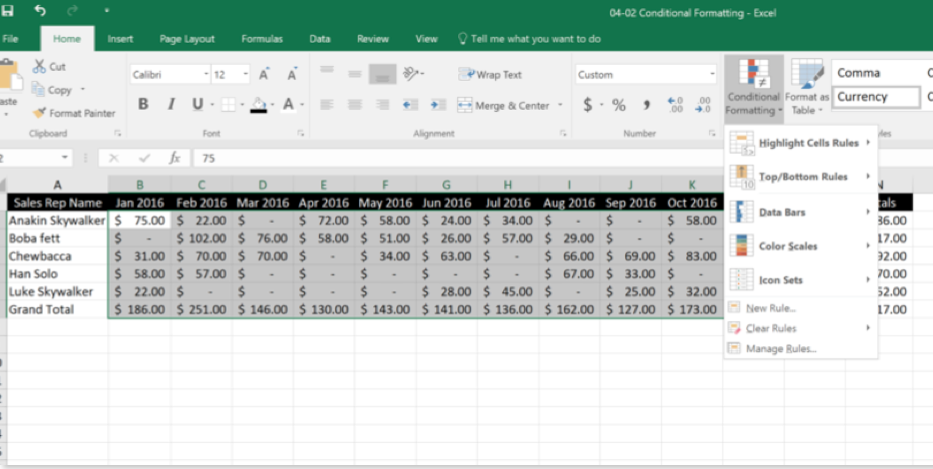
This is the screen you will get:
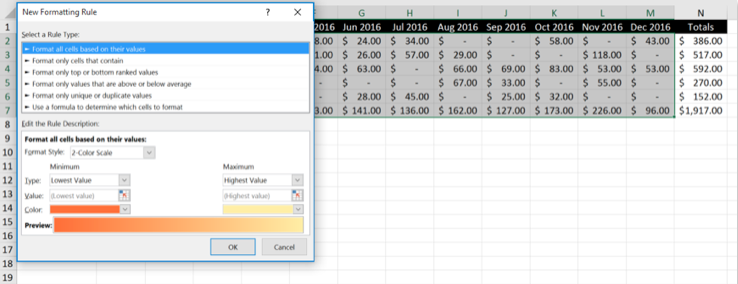
Under the first section, format all cells based on their values, we will leave everything the same except for the colors. Change the color selected on the left to Red (or pink if you feel its easier on the eyes), and the color on the right to green.

Here is what it should look like.

We can also tie the conditional formatting to another cell’s value. Let’s see if we can make the sheet dynamically update the heat map based on a sales quota. In order for this to work, we’ll need to create two rules; one if the sales amount is less than the quota and another if it’s greater than the quota.
Again, Highlight the data this applies to and in your home tab select Conditional Formatting, but this time select Manage Rules.
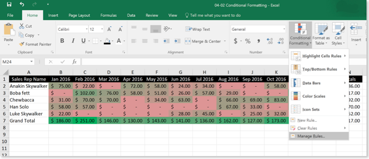

Double click on the first conditional formatting rule you created earlier
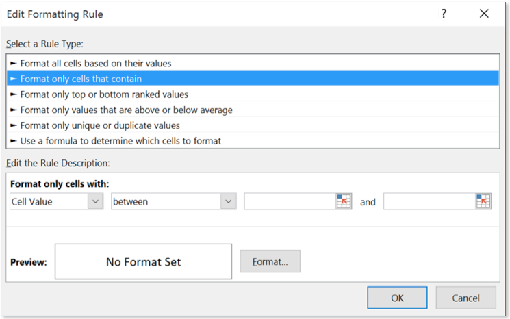
Select the second rule type.
We are going to set the second dropdown to “Less than” and enter “=$Q$1” into the last field because, in my example, i’m using cell Q1 to indicate what the sales quota is for the month.
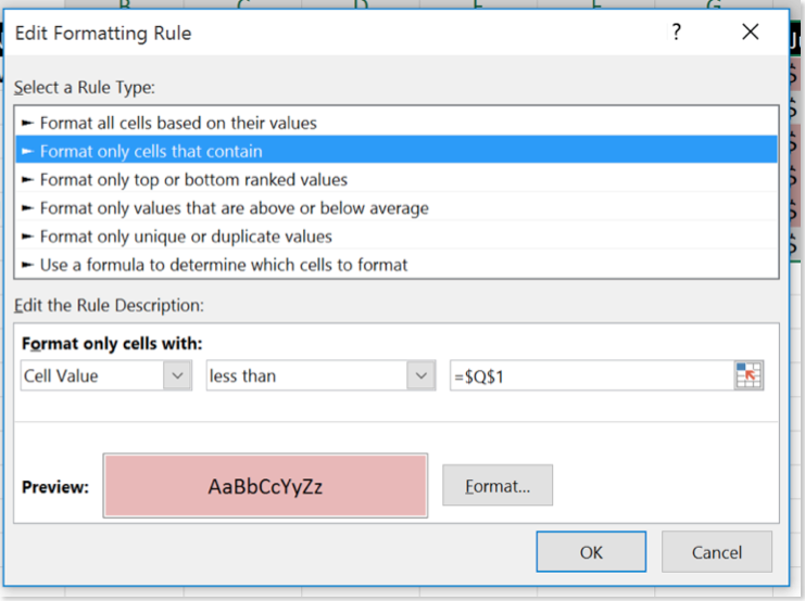
Once you do that, you will change the color to pink by selecting the format button. You are basically giving excel the following instructions:
Any Cell that contains a value less than what is in cell Q1, color it pink.
Note: You can also just select the cell you need by clicking on the little box with the arrow in it.
Hit ok, and then we do this again but this time we will set the second dropdown to “Greater than” and keep the cell reference the same:
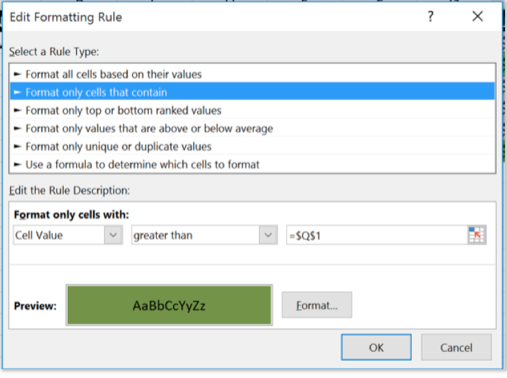
Here is the result of our efforts. Now we can change cell Q1 to any number and our conditional formatting will update based on the sales quota.

Let’s try something else. We have a list of unique transaction IDs but we suspect that some have been duplicated. Let’s use conditional formatting to sniff out the duplicates.
Highlight the data your want your conditional formatting to apply to and in your home tab select Conditional Formatting > New Rule…
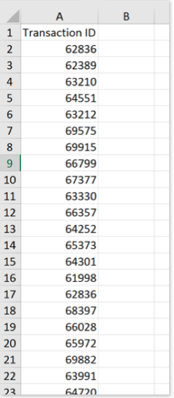
This time we’ll use the fifth rule type: Format only unique or duplicate values.
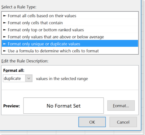
All we have to do is select the color that we want excel to highlight any duplicate values:
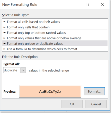
Now we know exactly where our duplicates are!

We can now filter the list by color for some added precision:
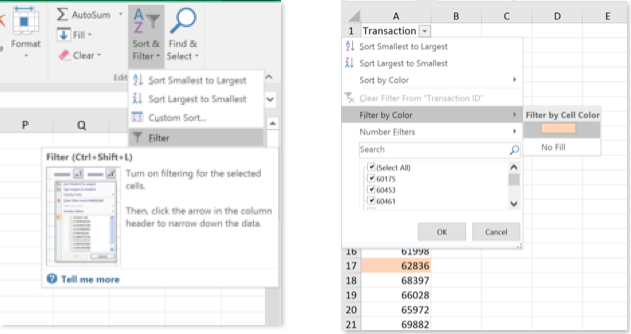
Voila!
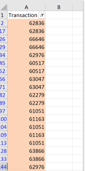
We can use conditional formatting for many different things. If you build a dashboard with multiple KPIs, conditional formatting is extremely useful to highlight good and bad metrics so that a high-level decision maker can take one glance and know whether things are going according to plan or they need to crack the whip.
The key here is to get creative. There are many different things you can do; look through the options and familiarize yourself with this feature. When the opportunity comes up don’t be afraid to experiment.
