The argument for and against using Speedometer Charts
I’ll first state that no matter what you read online, whether on this site or on another, you know your end user better than anyone else and, therefore, should make your own judgement call on whether you’ll use speedometer charts.
One of the first rules of creating dashboards is to understand your audience. If you think they’ll understand the message you’re trying to communicate better with a speedometer chart, then nobody should be able to convince you otherwise, just do it.
Just use a speedometer chart!
Now, with that out of the way, there are a lot of sites online that discourage from using speedometer charts in your dashboards, and many of their reasons are valid. But I believe there are advantages to using these kinds of charts.
Gauges, in the real world have been used for a long time to communicate critical pieces of information. They’re found in cars, airplanes, heavy machinery, even on some espresso machines. As a result, gauges have become intuitive. We immediately know how to read one when we see it.
You can use this to your advantage when creating dashboards. After all, the point of creating a dashboard is to communicate critical information in a manner that is easy for the user to understand and take action on.
Just keep in mind that:
- Use speedometer charts only when appropriate.
- They are terrible at communicating trends or historical data
- They can potentially take up a lot of space on your dashboard
With that said, let’s dive into how to create one from scratch.
How to create a speedometer chart
Here is the finished product:

We’ll be using two doughnut chart and a pie chart to build out speedometer chart. These will be comprised of three data tables, as seen below:
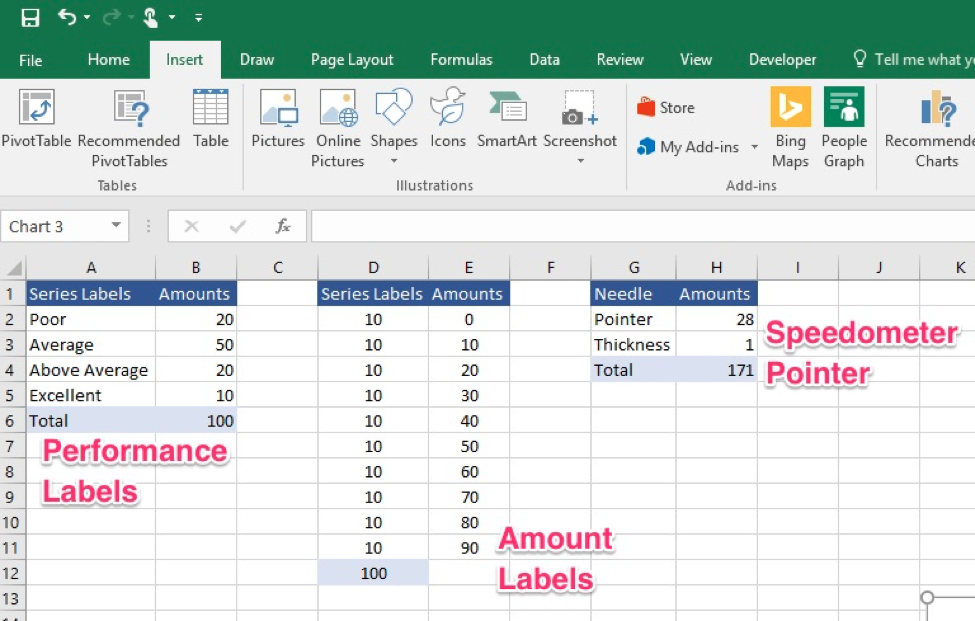
Step 1: Create The First of Two Doughnut Chart
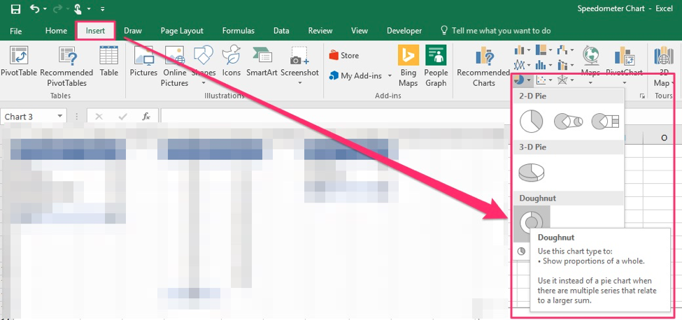
First, go to the Excel ribbon, click on Insert, go to the chart section and, under the dropdown seen in the screenshot below click on the doughnut chart.
Right-click and choose “Select Data…”

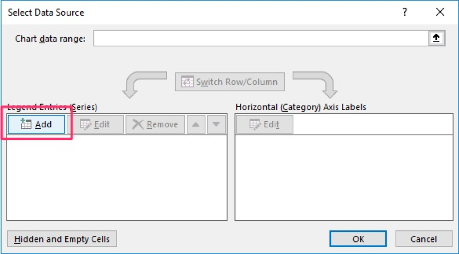
When the dialogue box opens, click on “Edit”. Here you will select the data in the first of the three tables:
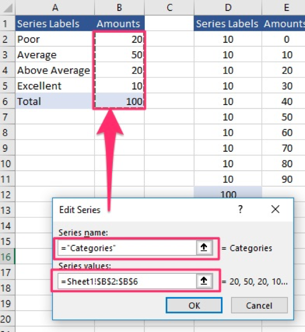
Once this is done, you’ll get the following doughnut chart.
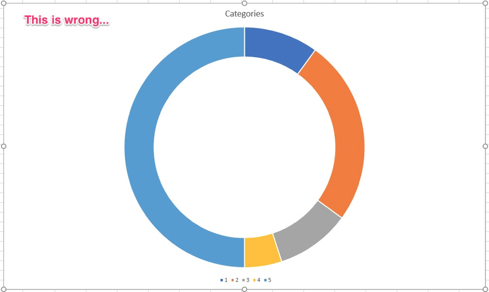
But you’ll notice it’s not a semi-circle (duh!) and it’s facing the wrong way. We’ll fix that right now:
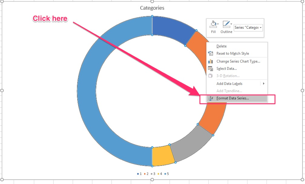
Right-click the chart and select “Format Data Series…”
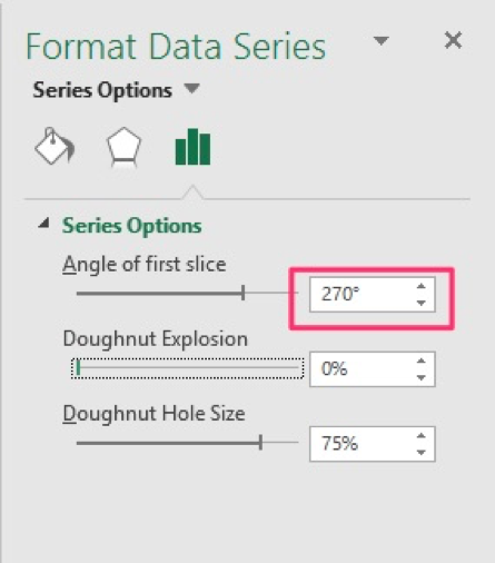
Under “Angle of first slice” enter 270 and hit “Enter” on your keyboard
This rotates the chart the right way:
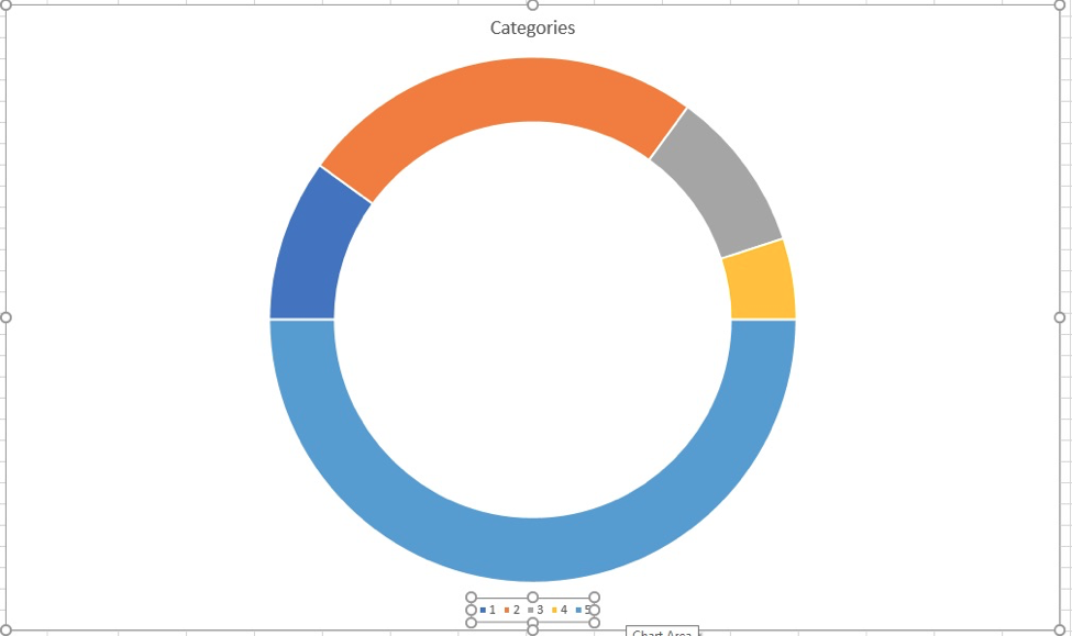
Next, we’ll hide the data series in the lower half by removing it’s color, , adding data labels, and formatting the chart appropriately.
Right-click on the bottom half of the chart and select “Format Data Series…” and in the menu select “No Fill”.
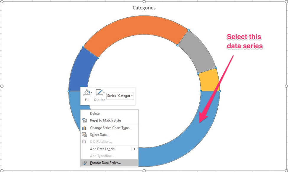

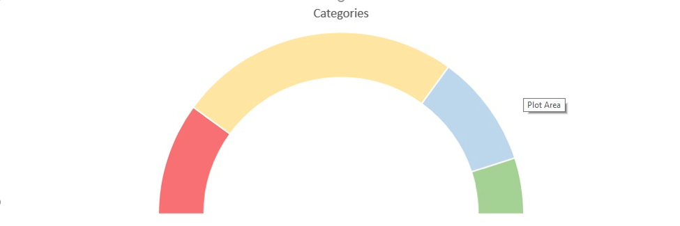
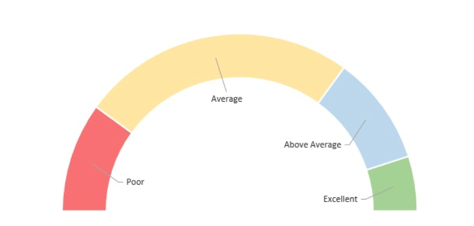
Next, change the colors of the other data series if you feel it’s necessary. Once you’re done, you should have something that looks like this:
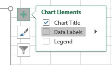
Next, add data labels:
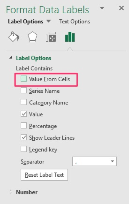
Right-click on the chart and select “Format Data Labels…”
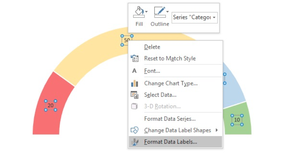
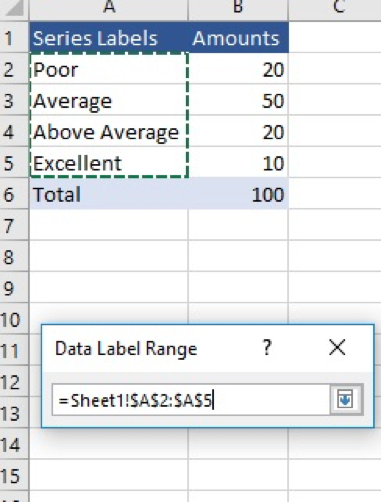
Select “Values from Cell” and select the labels in the first table
We’re finally done with the first chart… now for the second doughnut chart!
Step 2: Create the second doughnut chart
Right-click on the chart and choose “Select Data”
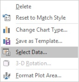
Click on “Add”
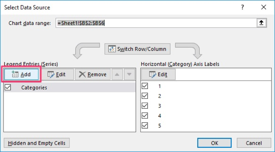
Select the appropriate data series and select ok
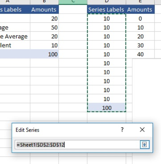
Once you do that, you will repeat the same steps as in the first chart we created. Turn the chart over 270 degrees, format the chart in the colors you feel are most appropriate, and change the labels. Once you’re done, your chart should look like the one below.
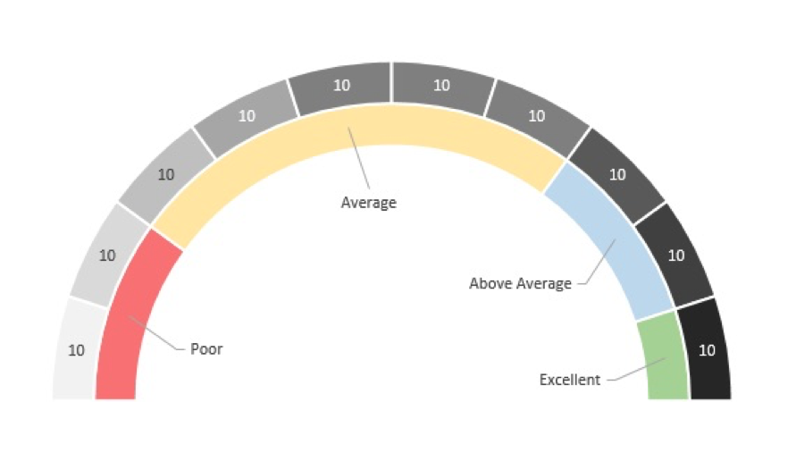
One thing to note: In my screenshot it looks like the labels at the top all show the number 10. This is wrong, you need to change the labels to display the data in the table:
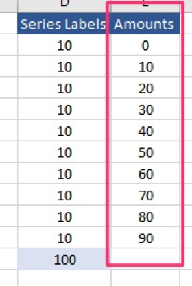
Step 3: Create the speedometer
We’re in the home stretch, just one more thing that needs to get done and that is building the pointer and linking it to a data point so that it moves dynamically along with the table’s data.
Right-click the chart again and choose “Select Data …” and select “Add” just like before

Select the data in the last table
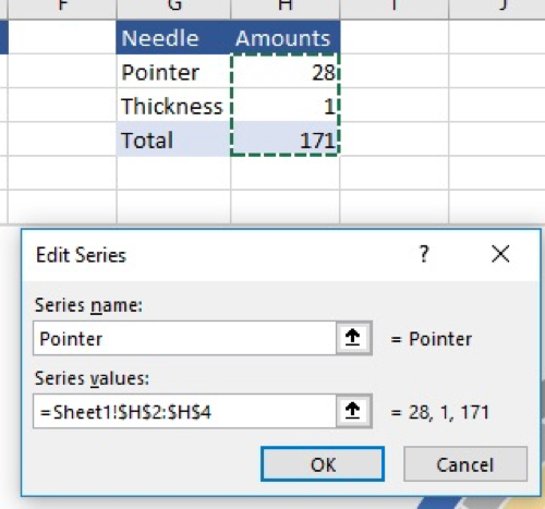
Once you click OK your chart will look like this:
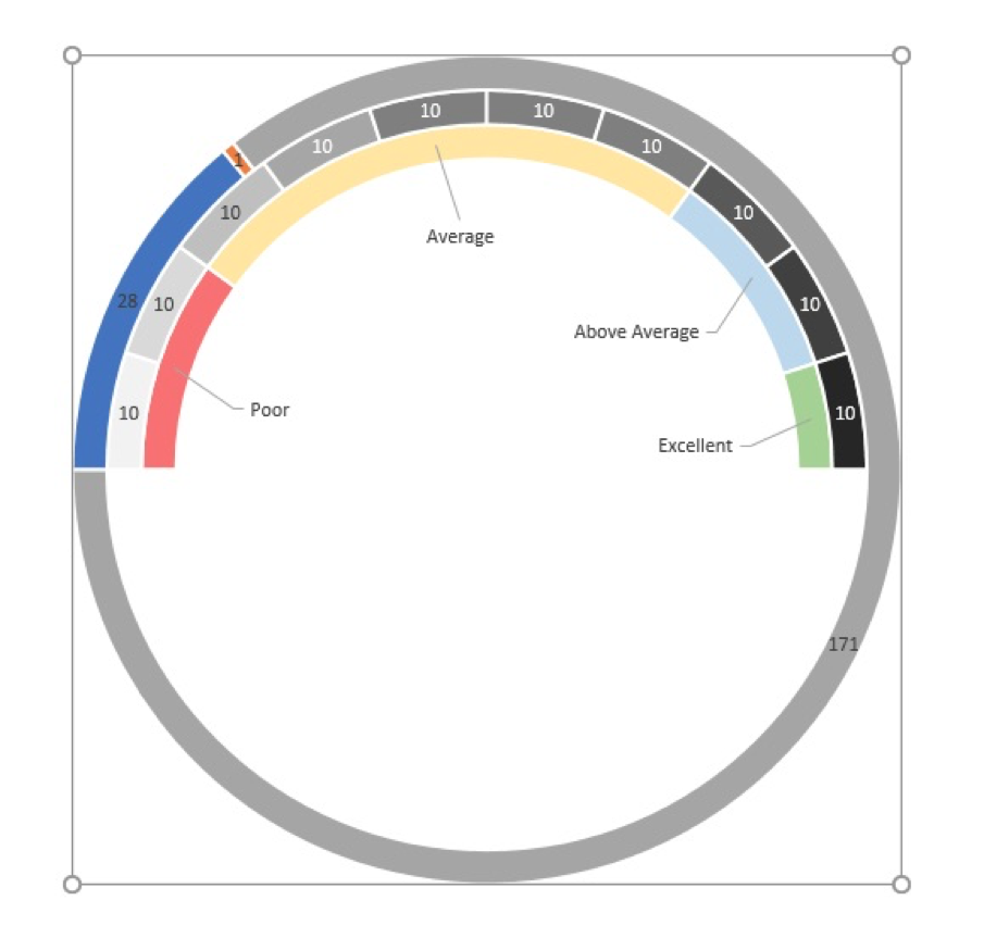
That looks nothing like a pointer, we’ll fix it though.
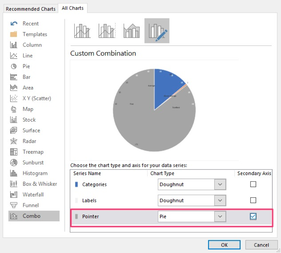
Excel defaulted to a doughnut chart, so we have to change it to a pie chart.
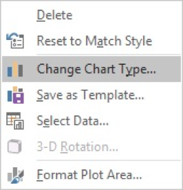
Right-click on the chart and select “Change Chart Type…”
Now change the dropdown on the third chart to “Pie” and checkmark the secondary axis option:
Once you’re done, rotate the chart like before by 270 degrees. You’ll chart will look like this:
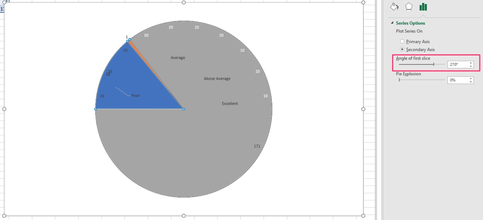
The chart has three sections: The gray area, the blue area, and the orange sliver at the 11 o’clock position in the screenshot below:
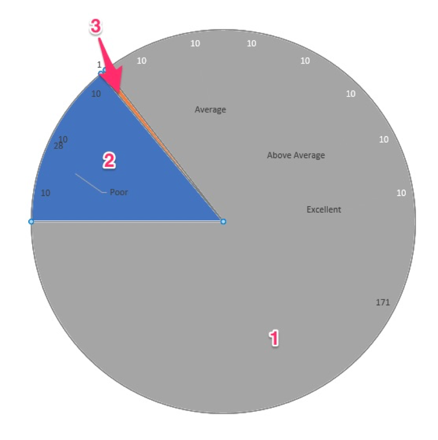
You’ll need to remove the color from sections 1 and 2 of the pie chart (like we did before when we selected the chart area and changed the color to “No Fill”). Once you’re done, your chart will look like this:
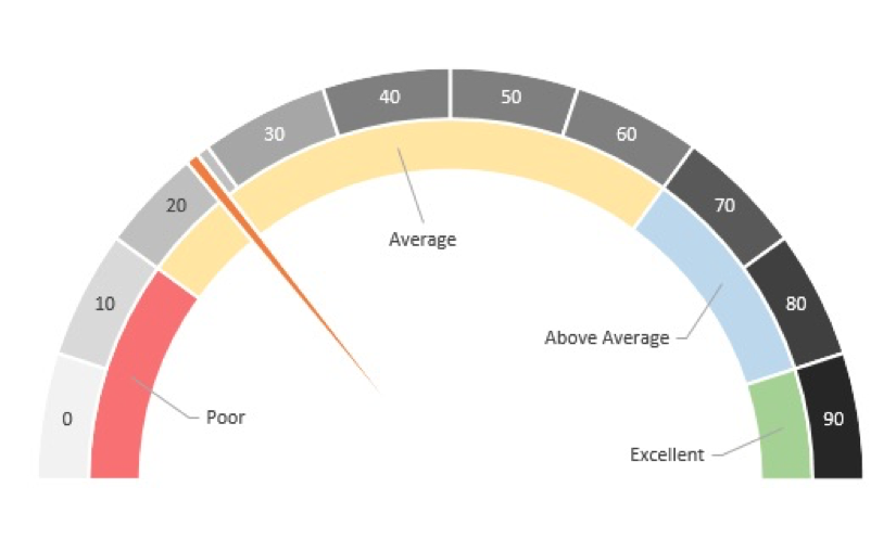
All done!
…or, are we?
There is one more thing I like to do when I create speedometer charts;. I add a text box that automatically updates with the numerical value represented by the speedometer. This minor addition makes the chart much more intuitive and easy to read.
Bonus Step: Add Dynamic Text Box
Go to the Insert tab in the ribbon and select “Text Box”

In the formula bar, enter a “=” symbol and reference the cell with the pointer data (in my sheet, it’s cell H2).
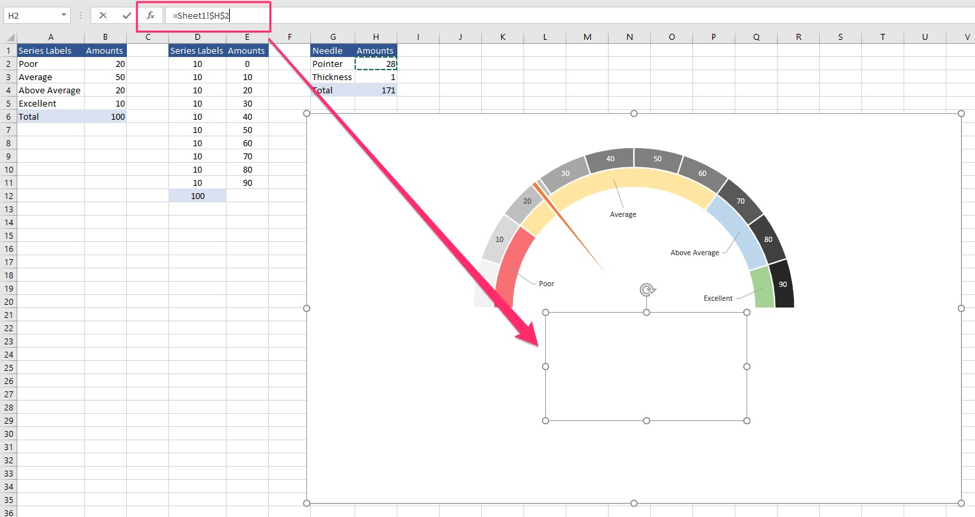
Next, format the text box box whoever you feel is appropriate. When the data in the tables get updated, the text box’s value will as well.

I hope this post added value to your daily Excel-ing!
For those of you looking for more advanced data visualization strategies,make sure to check out this book I read recently called Storytelling With Data. This is a phenominal book that improved my data visualization skills. These skills eventually helped me get approved to hire additional staff at work!
By the way, the link above is an affiliate link, which means that I earn a commission if you do end up purchasing this book. The commission is at no extra cost to you, and please if you have any questions related to this product, please let me know and I’d be happy to answer them for you.


